Widget Cards are versatile tools that provide key KaiNexus functionality and information in one convenient location.
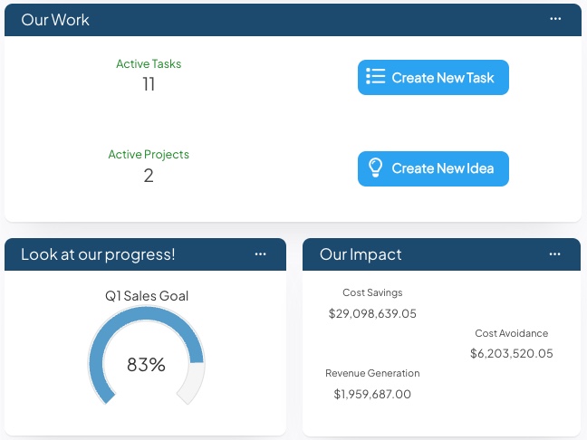
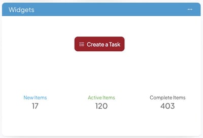
This example shows three Widget Cards containing Item Count, Create Button, Chart Goal, and Impact Widgets
Keep reading to learn about the following:
Add a Widget Card
Who can add a Card to a Board?
- The Board's Owner, if they have the "Create Boards" permission.
- The Board's Editor(s), if they have the "Create Boards" permission.
- Anyone with the "Board Administrator" permission for Boards in that Board's Location.
 Boards can have up to 16 Cards. Once a Board has 16 Cards, you won't be able to add or copy additional Cards to that Board.
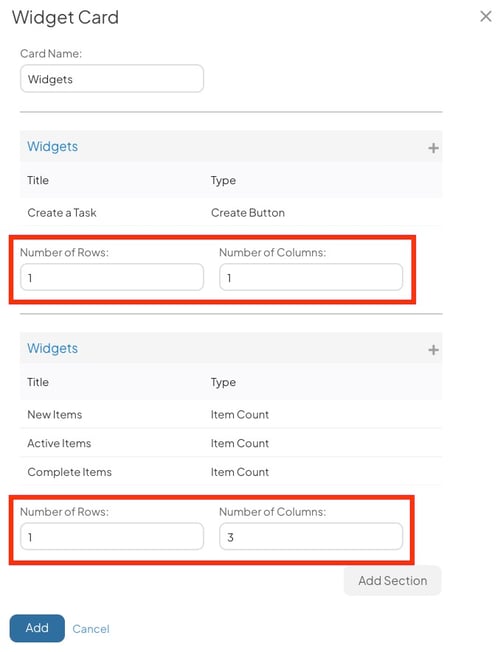
Add a new Widget Card
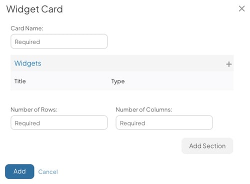
Open the Board with which you want to work, then:
- Click Add in the top right corner of the Board.

- Click Widgets in the resulting drop-down menu, and the Widget Card window will open.
-
- Card Name (required): The name will appear in the Card's primary header and can be used to identify this Card.
- Number of Rows (required): Enter the number of rows that should be included on this Card. There can be up to 5.
- Number of Columns (required): Enter the number of columns that should be included on this Card. There can be up to 5.
-
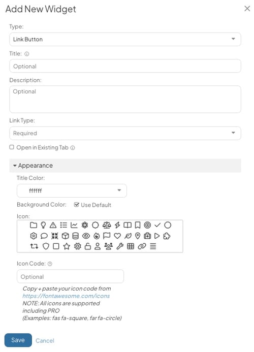
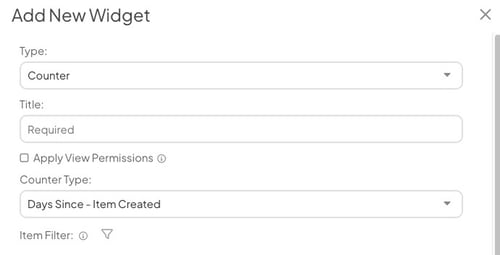
- Click the plus icon in the top right corner of the “Widgets” section, and the Add New Widget window will open.
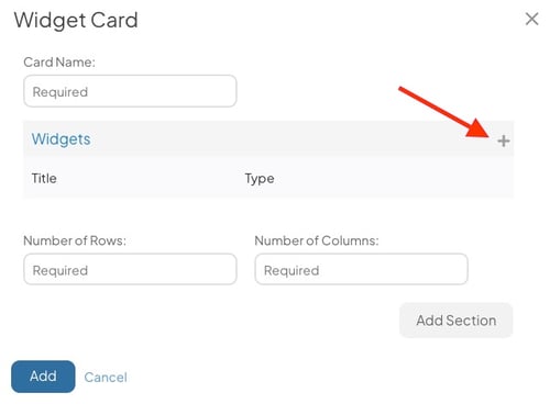
- Click the plus icon in the top right corner of the “Widgets” section, and the Add New Widget window will open.
- In the Add New Widget window, select:
/Cards/Widget%20Cards/Add%20New%20Widget.jpeg?width=475&height=195&name=Add%20New%20Widget.jpeg)
-
-
Title (required): The title will be used to identify this widget.
-
Type (required): Expand the drop-down to select the type of widget you want to add to this Card. Once you've made your selection, additional options will appear. The possible widgets are:
- Link Button
- People Count
- Counter
-
ROI (Only available if your organization has the Advanced ROI Module)
- Goal
- Habit Score
-
-
Select Save after you have configured the Widget-specific options.
-
Add additional Widgets to fill the rows and columns on your Widget Card.
-
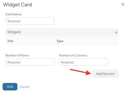
Select Add Section to add another Section to the Card. Having multiple Sections on your Widget Card allows you to display Widgets in a different combination of rows and columns in each new Section.
-
In each new Section, you can set the number of Rows and Columns and add Widgets to that Section.
- Click and drag a Widget to move it between Sections.
- The Widgets added to each Section will respect the Rows and Columns in their Section. Here is an example of what your Widget Card could look like using Sections:
-
-
Select Add to finalize the Widget Card and add it to the Board.
Types of Widgets
Each Widget has a different set of configuration options and parameters for who can view it. This section will discuss the differences in configuring each Widget type.
Chart Goal Widget
Chart Goal Widgets display the goal gauge for a Threshold or Bowling Chart. This allows anyone looking at the Board to check a Chart Goal's progress without opening the Item.
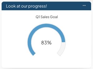
Example of a Chart Goal Widget
Select Chart Goal as your Widget type on the Add New Widget window to add this Widget to a Card.
/Cards/Widget%20Cards/Add%20New%20Chart%20Goal%20Widget.jpeg?width=500&height=257&name=Add%20New%20Chart%20Goal%20Widget.jpeg)
- Chart: Use this field to search for and select a Chart. The Widget will display the Chart's Goal. You should only select a Threshold or Bowling Chart with a goal enabled.
- Appearance: Use the options in this section to customize the Widget's appearance. The color of the gauge will match the colors configured on the Chart, but you have options to customize the text on the Widget.
- Title Color: Pick a color for the Widget's title.
- Gauge Text Color: Pick a color for the percent progress number inside the gauge.
/Ofie/Ofie%20Profile%20Pic.png?width=50&height=50&name=Ofie%20Profile%20Pic.png) Warning: Only people with permission to view the referenced Chart can see this widget.
Warning: Only people with permission to view the referenced Chart can see this widget.
Create Button Widget
Create Button Widgets help anyone with access to the Board quickly create a particular type of Item.
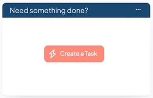
Example of a Create Button Widget.
Select Create Button as your Widget type on the Add New Widget window to add this Widget to a Card.
/Cards/Widget%20Cards/Add%20new%20Create%20Widget.jpeg?width=500&height=389&name=Add%20new%20Create%20Widget.jpeg)
- Description: Enter an optional description in this field. The description will appear when people hover over this Create button.
- Parent: If you want all Items created via this button to be automatically nested under a particular Item, enter that parent into the “Parent” field.
- People who do not have permission to nest an Item under the chosen parent will not see this Create button when they access this Board.
- Template: If you want to control which templates are available to create from this button, expand this drop-down and select the ones you want to include.
- If you entered a parent, be sure that the parent supports the selected templates. Any templates not supported by the parent will not appear on the Create button.
- People who do not have permission to create any of the selected templates will not see this Create button when they access this Board.
- Appearance: Use the options in this section to customize the Widget's appearance.
- Title Color: Pick a color for the title text on the Create Button.
- Background Color: Pick a color for the Link Button.
- When the Use Default checkbox is selected, the Link Button Widget will default to blue. If your organization is using the Branding Module, the color will be the same as the menu drop-downs for each section in the Navigation Bar.
- When the Use Default checkbox is unselected, you can pick a unique color for the Link Button.
- Icon: Pick an icon that will appear on the Link Button beside the title.
- The Link Button will use a default icon that best matches the URL, Item, Item List, or Board to which you are linking. However, you can always pick a unique icon.
- Icon Code: If you want to use a different icon beside the standard selections, enter an icon code from Font Awesome.
Link Button Widget
Link Button Widgets make navigating to other website URLs, Items, Boards, and Item List easy and enticing.
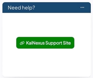
Example of a Link Button Widget. Clicking the button will open the KaiNexus Support Site in a new tab.
Select Link Button as your Widget type on the Add New Widget window to add this Widget to a Card.
- Title: Enter the text you want to appear on the Link Button. If this field is left blank, the URL or the name of the Item, Item List, or Board will appear on the button.
- Description: Enter an optional description in this field. The description will appear when people hover over this Link button.
- Link Type: Use the drop-down to select the type of content you are linking to.
- URL: Link to a website outside of KaiNexus. In the resulting field, enter the website URL.
- Board: Link to a KaiNexus Board. In the resulting drop-down, pick a Board.
- Only Boards on which you are a Viewer, Editor, or Owner will be available.
-
- Item: Link to a specific specific Item in KaiNexus. In the resulting drop-down, pick an Item.
- Item List: Link to a custom List in the Items section. In the resulting drop-down, pick an Item List.
- Open in Existing Tab (not available for URL Link Type): By default, Board, Item, and Item List links will open in the user's existing tab, navigating them away from the Board. Unselect this checkbox for the link to open in a new tab instead.
- URL Link Buttons will always open the webpage in a new tab.
- Appearance: Use the options in this section to customize the Widget's appearance.
- Title Color: Pick a color for the title text on the Link Button.
- Background Color: Pick a color for the Link Button.
- When the Use Default checkbox is selected, the Links Button Widget will be the same color as the Link Button in the Navigation Bar.
- When the Use Default checkbox is unselected, you can pick a unique color for the Link Button.
- Icon: Pick an icon to appear on the Link Button beside the title.
- Icon Code: If you want to use a different icon beside the default selections, enter an icon code from Font Awesome.
Item Count Widget
Item Count Widgets display the number of Items that meet your specified requirements. When you select the number, you can view a List of the Items counted in the Widget.
/Cards/Widget%20Cards/Item%20Count%20Widget%20Example.jpeg?width=300&height=210&name=Item%20Count%20Widget%20Example.jpeg) Example of two Item Count Widgets on a Card
Example of two Item Count Widgets on a Card
Select Item Count as your Widget type on the Add New Widget window to add this Widget to a Card.
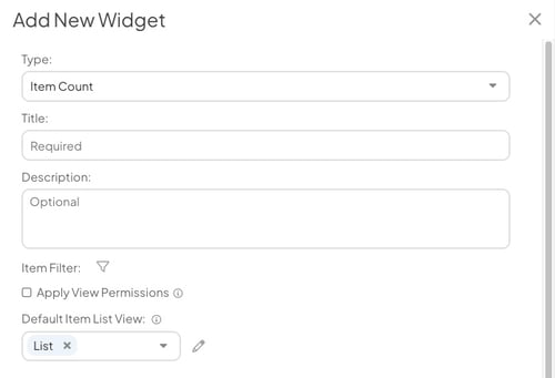
- Title: Enter a title for your Widget.
- Description: Enter an optional description in this field. The description will appear when people hover over this widget.
- Item Filter: If you do not apply any filters, this widget will return a count of all Items in the system. Click the filter icon to open the Item Filter window and apply the appropriate filters to have it return a list of Items meeting certain requirements instead.
- Apply View Permissions: When this box is checked, the number each person sees on this Widget will reflect their view permissions. This can result in different people seeing different results.
- When this box is not checked, the number each person sees on this Widget will reflect the true number of Items that meet the requirements. This can result in a person seeing one number on the widget and a smaller number when they expand the List of Items.
- Default Item List View: Use the field to select which List view you want to see upon selecting the Item Count Widget.
- Use the pencil icon to customize the columns on your default List view.
- The changes you make will affect how the Item List looks each time you select the Widget. You can temporarily adjust filters and columns as you view the List.
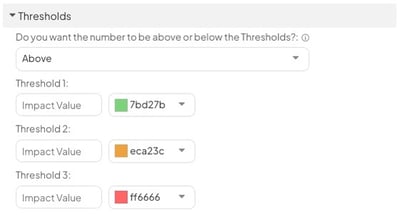
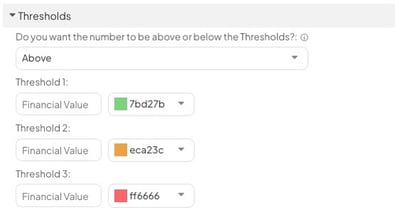
- Thresholds (Optional): Enter up to three Thresholds to visually indicate whether metrics are being met. When the Widget's value reaches one of your custom Thresholds, it will change color. If no Thresholds are met, the Widget will respect your color settings beneath the Appearance header.
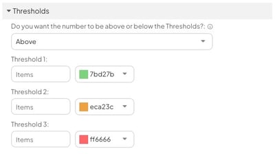
- Do you want the number to be above or below the Thresholds?
- Above: The Widget will change color when the value meets or exceeds the Threshold.
- Below: The Widget will change color when the value meets or is below the Threshold.
- Threshold 1, Threshold 2, and Threshold 3: Enter a Threshold value and select a corresponding color. The Widget will display this color when the Threshold value is met.
- Leave any Threshold blank to exclude it.
- Do you want the number to be above or below the Thresholds?
- Appearance: Use the options in this section to customize the Widget's appearance.

- Title Color: Pick a color for the Widget's title.
- Value Color: Pick a color for the Item Count number.
People Count Widget
People Count Widgets display the number of Users that meet your specified requirements. When you select the number, you can view a List of people counted in the Widget.
This is a great way to view the number of people who have fulfilled certain Team Roles, earned specific Badges, received important certifications, and more.
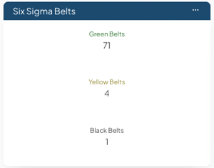
Example of three People Count Widgets showing the number of Users who have earned various Custom Badges
Select People Count as your Widget Type on the Add New Widget window to add this Widget to a Card.

- Title: Enter a title for your Widget.
- Description: Enter an optional description in this field. The description will appear when people hover over the Widget.
- User Filter: Select the person icon to enter the User Filter. This is where you can set the criteria for which Users should be included in the People Count. Check out this article for more information on how to use the User Filter.
- Customize Default Columns: Select Edit Columns to modify which columns appear in the People List that opens when you select the Widget.
- If you do not edit the columns, the Widget will use your organization's default.
- Thresholds (Optional): Enter up to three Thresholds to visually indicate whether metrics are being met. When the Widget's value reaches one of your custom Thresholds, it will change color. If no Thresholds are met, the Widget will respect your color settings beneath the Appearance header.
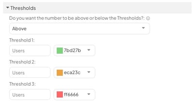
- Do you want the number to be above or below the Thresholds?
- Above: The Widget will change color when the value meets or exceeds the Threshold.
- Below: The Widget will change color when the value meets or is below the Threshold.
- Threshold 1, Threshold 2, and Threshold 3: Enter a Threshold value and select a corresponding color. The Widget will display this color when the Threshold value is met.
- Leave any Threshold blank to exclude it.
- Do you want the number to be above or below the Thresholds?
- Appearance: Use the options in this section to customize the Widget's appearance.

- Title Color: Pick a color for the Widget's title.
- Value Color: Pick a color for the People Count number.
Counter
Counter Widgets help you count the number of days or hours since certain events occurred, making them an excellent tool for tracking the frequency of incidents, issues, and more. You can even use them to count down or up to specific dates. Try adding one to a team Board when there is an upcoming event everyone should know about.
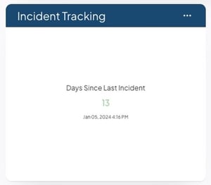
Example of a Counter Widget. You can easily see how long it's been since an incident was reported.
Select Counter as your Widget Type on the Add New Widget window to add this Widget to a Card.
- Title: Enter a title for your Counter Widget.
- Counter Type: Select which type of counter you want.
- Days Since - Item Created: Count the number of days since a certain type of Item was created. The most recently created Item meeting your criteria will be the starting point for the counter.
- Days Since - Item Completed: Count the number of days since a certain type of Item was completed. The most recently completed Item meeting your criteria will be the starting point for the counter.
- Days Since - Date: Count the number of days since a certain date.
- Hours Since - Item Created: Count the number of hours since a certain type of Item was created. The most recently created Item meeting your criteria will be the starting point for the counter.
- Hours Since - Item Completed: Count the number of hours since a certain type of Item was completed. The most recently completed Item meeting your criteria will be the starting point for the counter.
- Hours Since - Date: Count the number of hours since a certain date.
- Days Until - Date: Count the number of days until a certain date.
- Hours Until - Date: Count the number of hours until a certain date.
- If the Counter Widget tracks Items, you will see the following options:
- Apply View Permissions: When this box is checked, the number each person sees on this Widget will reflect their view permissions. This can result in different people seeing different results.
- When this box is not checked, the number each person sees on this Widget will reflect the true number of Items that meet the requirements. This can result in a person seeing one number on the widget and a smaller number when they expand the List of Items.
- Item Filter: Select the filter icon to set criteria for which Items you want to count.
- Apply View Permissions: When this box is checked, the number each person sees on this Widget will reflect their view permissions. This can result in different people seeing different results.
- If the Counter Widget tracks dates, you will see the following option:
- Date: Use the field to select the Date from which your Widget will count.
- Thresholds (Optional): Enter up to three Thresholds to visually indicate whether metrics are being met. When the Widget's value reaches one of your custom Thresholds, it will change color. If no Thresholds are met, the Widget will respect your color settings beneath the Appearance header.

- Do you want the number to be above or below the Thresholds?
- Above: The Widget will change color when the value meets or exceeds the Threshold.
- Below: The Widget will change color when the value meets or is below the Threshold.
- Threshold 1, Threshold 2, and Threshold 3: Enter a Threshold value and select a corresponding color. The Widget will display this color when the Threshold value is met.
- Leave any Threshold blank to exclude it.
- Do you want the number to be above or below the Thresholds?
-
Appearance: Use the options in this section to customize the Widget's appearance.
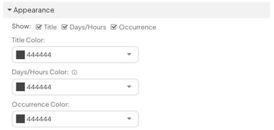
- Show: Pick which information you want to be displayed on the Widget.
- Select Title to show the Title of the Widget
- Select Days/Hours to show the count.
- Select Occurrence to show the date from which the Widget is counting.
- Show: Pick which information you want to be displayed on the Widget.
-
- Title Color: Pick a color for the Widget's title.
- Days/Hours Color: Pick a color for the count.
- Occurrence: Pick a color for the date from which the Widget is counting.
Impact Unit or Time Savings (Hours)
Impact Unit and Time Savings (Hours) Widgets display the Impact of Items that meet your specified requirements. Selecting the Impact will open a List of Items referenced in the Widget.
Impact Unit Widgets display Impact measured in units, while Time Savings (Hours) Widgets display the Time Saving Impact Type.
/Cards/Widget%20Cards/Time%20Savings%20Widget%20Example.jpeg?width=300&height=175&name=Time%20Savings%20Widget%20Example.jpeg) Example of Time Savings (Hours) Widget
Example of Time Savings (Hours) Widget
Select Impact Unit or Time Savings (Hours) on the Add New Widget window to add these Widgets to your Card.

- Title: Enter a title for your Widget.
- Description: Enter an optional description in this field. The description will appear when people hover over this widget.
- Impact (required): Expand this drop-down to select the Impact(s) you'd like this widget to display.
- Impact Value: If you do not select any Impact Values, this widget will return the sum of all Impact Values for the selected Impact(s). If you'd like to narrow down the result to only include certain Impact Values, expand this drop-down to select the ones you'd prefer.
- If the selected Impact(s) have not yet had any Values defined, this option will not be available.
- Impact Attribute: Expand the drop-down to select an Impact Attribute.
- This option will only appear if your organization has at least one Impact Attribute configured.
- After you select an Impact Attribute, a second Attribute Value drop-down will appear.
- Select one or multiple Attribute Values. Only Impacts tagged with that Attribute Value will contribute to the Widget.
- If you select an Impact Attribute, but not an Attribute Value, the Widget will include all Impacts tagged with the Impact Attribute, regardless of which Value is selected.
- Resolution Type (required): Expand this drop-down to select which type of Resolution's data should be included in this widget. This option may not appear if your organization isn't using Target or Forecast Resolutions.
- Amount Type: Expand this drop-down to select which Amount Type an Impact must have to be included in this widget. Your options are Unknown, One-Time, and Recurring. If your organization utilizes the Advanced ROI Module, you'll also see Range and Custom Schedule options.
- Realized Date: Enter a Starting and Ending Realized date if you only want to include data for impacts realized within certain dates.
- Item Filter: If you do not apply any filters, this widget will return data for all Items in the system. Click the filter icon to open the Item Filter window and apply the appropriate filters to have it return a list of Items meeting certain requirements instead.
/Ofie/Ofie%20Profile%20Pic.png?width=45&height=45&name=Ofie%20Profile%20Pic.png) Pro Tip: If you want to filter the Widget by Impact Location, add a Location Filter to your Board and enable the Location Type Filter. Selecting Impact on the Filter causes the Widget to only show Impacts tagged with the specified Location.
Pro Tip: If you want to filter the Widget by Impact Location, add a Location Filter to your Board and enable the Location Type Filter. Selecting Impact on the Filter causes the Widget to only show Impacts tagged with the specified Location.
- Apply View Permissions: When this box is checked, the number each person sees on this widget will reflect their view permissions. This can result in different people seeing different results.
- When this box is not checked, the number each person sees on this widget will reflect the true number of Items that meet the requirements. This can result in a person seeing one number on the widget and a smaller number when they expand the list of Items.
- Default Item List View: Use the field to select which List view you want to see upon selecting the Widget.
- Use the pencil icon to customize the columns on your default List view.
- The changes you make will affect how the Item List looks each time you select the Widget. You can temporarily adjust filters and columns as you view the List.
- Thresholds (Optional): Enter up to three Thresholds to visually indicate whether metrics are being met. When the Widget's value reaches one of your custom Thresholds, it will change color. If no Thresholds are met, the Widget will respect your color settings beneath the Appearance header.
- Do you want the number to be above or below the Thresholds?
- Above: The Widget will change color when the value meets or exceeds the Threshold.
- Below: The Widget will change color when the value meets or is below the Threshold.
- Threshold 1, Threshold 2, and Threshold 3: Enter a Threshold value and select a corresponding color. The Widget will display this color when the Threshold value is met.
- Leave any Threshold blank to exclude it.
- Do you want the number to be above or below the Thresholds?
- Appearance: Use the options in this section to customize the Widget's appearance.
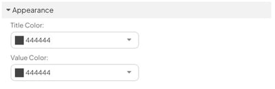
- Title Color: Pick a color for the Widget's title.
- Value Color: Pick a color for the Impact data.
Warning: Only people with the "View Impact" permission can see this widget's value.
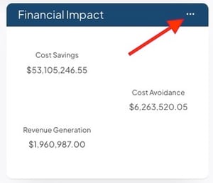
Total Financial Impact or ROI
Total Financial Impact Widgets display the Financial Impact of Items that meet your specified requirements. ROI Widgets display the return on investment of Items that meet your specified requirements.
Selecting the Widget will open a List of Items referenced in the Widget.
/Cards/Widget%20Cards/Financial%20Impact%20Widget%20Example.jpeg?width=300&height=214&name=Financial%20Impact%20Widget%20Example.jpeg) Example of three Total Financial Impact Widgets on a Card
Example of three Total Financial Impact Widgets on a Card
Select Total Financial Impact or ROI on the Add New Widget window to add these Widgets to a Card.

- Title: Enter a title for your Widget.
- Description: Enter an optional description in this field. The description will appear when people hover over this widget.
- Impact (required): Expand this drop-down to select the Impact(s) you want this widget to display.
- Impact Value: If you do not select any Impact Values, this widget will return the sum of all Impact Values for the selected Impact(s). If you'd like to narrow down the result to only include certain Impact Values, expand this drop-down to select the ones you'd prefer.
- Impact Attribute: Expand the drop-down to select an Impact Attribute.
- This option will only appear if your organization has at least one Impact Attribute configured.
- After you select an Impact Attribute, a second Attribute Value drop-down will appear.
- Select one or multiple Attribute Values. Only Impacts tagged with that Attribute Value will contribute to the Widget.
- If you select an Impact Attribute, but not an Attribute Value, the Widget will include all Impacts tagged with the Impact Attribute, regardless of which Value is selected.
- Resolution Type (required): Expand this drop-down to select which type of Resolution's data should be included in this widget. This option may not appear if your organization isn't using Target or Forecast Resolutions.
- Realized Date: Enter a Starting and Ending Realized date if you only want to include data for impacts realized within certain dates.
- Item Filter: If you do not apply any filters, this widget will return data for all Items in the system. Click the filter icon to open the Item Filter window and apply the appropriate filters to have it return a list of Items meeting certain requirements instead.
Pro Tip: If you want to filter the Widget by Impact Location, add a Location Filter to your Board and enable the Location Type Filter. Selecting Impact on the Filter causes the Widget to only show Impacts tagged with the specified Location.
-
Reported in (appears only if your organization uses multi-currency): Select one or more currencies to include in the Widget. Any Impact initially logged in these currencies will be included in the Widget's value.
- Select Any Currency to include all Impacts, regardless of which currency they were logged in.
- Select Default to include Impact initially logged in the Board viewer's default currency.
- Display as (appears only if your organization uses currency conversion): Select which currency the Impact Widget displays. Any currencies selected in the "Reported in" field will be converted to this currency and summated in the Widget's value.
- Select Default to display the value in the Board viewer's default currency
Pro Tip: A user’s default currency is determined by their user profile setting, the currency assigned to their Location, or the organization’s primary currency if neither of the previous options is set.
If you want the Widget to include Impacts logged in any currency and convert them to the Board viewer’s local currency, select Any Currency for Reported in and Default for Display as.

- Apply View Permissions: When this box is checked, the number each person sees on this widget will reflect their view permissions. This can result in different people seeing different results.
- When this box is not checked, the number each person sees on this widget will reflect the true number of Items that meet the requirements. This can result in a person seeing one number on the widget and a smaller number when they expand the list of Items.
- Default Item List View: Use the field to select which List view you want to see upon selecting the Widget.
- Use the pencil icon to customize the columns on your default List view.
- The changes you make will affect how the Item List looks each time you select the Widget. You can temporarily adjust filters and columns as you view the List.
- Thresholds (Optional): Enter up to three Thresholds to visually indicate whether metrics are being met. When the Widget's value reaches one of your custom Thresholds, it will change color. If no Thresholds are met, the Widget will respect your color settings beneath the Appearance header.
- Do you want the number to be above or below the Thresholds?
- Above: The Widget will change color when the value meets or exceeds the Threshold.
- Below: The Widget will change color when the value meets or is below the Threshold.
- Threshold 1, Threshold 2, and Threshold 3: Enter a Threshold value and select a corresponding color. The Widget will display this color when the Threshold value is met.
- Leave any Threshold blank to exclude it.
- Do you want the number to be above or below the Thresholds?
- Appearance: Use the options in this section to customize the Widget's appearance.

- Title Color: Pick a color for the Widget's title.
- Value Color: Pick a color for the Impact data.
Warning: Only people with the "View Impact" permission can see this Widget's value.
Goal Widget
Goal Widgets are a great way to visualize a Location’s progress toward its Item, Impact, and People Goals. They include a gauge showing a Location’s progress toward its Goal as well as the Location’s Goal Value, current value, and the % to Goal.
Selecting the gauge will open a List of Items contributing to the Goal.
/Goals/Goal%20Widget%201.jpeg?width=300&height=299&name=Goal%20Widget%201.jpeg)
Example of Goal Widget displaying an Impact Goal
Pro Tip: Do you need to edit Goal criteria? Check out this article for information on how you can edit Goals.
To add this Widget to a Card, select Goal as your Widget type in the Add New Widget window.

- Title: Enter the title you want for the Goal Widget.
- Goal: Select which Goal should be displayed on the Widget.
- Location (Optional): Select which Location's Goal the Widget should display. The Widget will display the Goal for this Location regardless of what is selected in the Location Filter, Board Filter, or Location Quick Filter on the Board.
- If you do not enter a Location, your Board must have a Location Filter or Location Quick Filter. The Goal Widget will populate data for whichever Location you select in the filters.
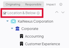
- Location & Below: When selected, the Goal Widget will display the Location & Below Goal for the Location entered in the Location field.
- The Goal Widget will display the Location Only Goal for the Location entered in the Location field if unselected.
- This checkbox will not affect the Goal Widget if no Location is entered in the Location field. Whether the Location Only or Location & Below Goal is displayed will depend on the Location & Below checkbox on the Location Filter.
- If you selected an Item or Impact Goal:

- Currency: This dropdown will appear if an Impact Goal is selected and your organization uses multiple currencies. Pick which currency for which you want to see Goal information.
- Apply View Permissions: When this box is checked, the number each person sees on this Widget will reflect their view permissions. This can result in different people seeing different results.
- When this box is not checked, the number each person sees on this Widget will reflect the true number of Items that meet the requirements. This can result in a person seeing one number on the Widget and a smaller number when they expand the List of Items.
- Default Item List View: Use this field to select which List view you want to see upon selecting the Goal Widget.
- Select the pencil icon to customize the columns on your default List view.
- The changes you make will affect how the Item List looks each time you select the Widget. You can temporarily adjust filters and columns as you view the List.
- If you selected a People Goal:

- Customize Default Columns: Select Edit Columns to customize which columns will appear on the People List you open from the Widget.
- Thresholds (Optional): Enter up to three Thresholds to visually indicate whether metrics are being met. When the Widget's value reaches one of your custom Thresholds, the value and the gauge will change color. If no Thresholds are met, the Widget will respect your color settings beneath the Appearance header.
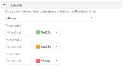
- Do you want the number to be above or below the Thresholds?
- Above: The Widget will change color when the value meets or exceeds the Threshold.
- Below: The Widget will change color when the value meets or is below the Threshold.
- Threshold 1, Threshold 2, and Threshold 3: Enter a Threshold value and select a corresponding color. The Widget will display this color when the Threshold value is met.
- Leave any Threshold blank to exclude it.
- Do you want the number to be above or below the Thresholds?
- Appearance: Use the options in this section to customize the Widget's appearance.
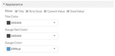
- Show: Use the checkboxes to customize which information you want to be displayed on the Widget.
- Title: The Title of the Widget
- % to Goal: The percent completion of the Goal
- Current Value: The Location’s current progress toward the Goal.
- Goal Value: The target the Location is trying to reach
- User Goal Count (People Percentage Goals Only): The number of users meeting your Goal's criteria. This is the numerator in the Goal calculation.
- User Total Count (People Percentage Goals Only): The number of users meeting your Goal's "total" criteria. This is the denominator in the Goal calculation.
- Title Color: Pick a color for the Widget's title.
- Gauge Text Color: Pick a color for the % to Goal, Current Value, and Goal Value text.
- Gauge Color: Pick a color for the Widget's gauge.
- Show: Use the checkboxes to customize which information you want to be displayed on the Widget.
Habit Score Widget
Habit Score Widgets help you display the Habit Score of one user at a time. They can be configured to show the Habit Score of a specific person, such as an executive, or the current user viewing the Board.
Selecting the Habit Score opens the Habits tab of the user's Activity, which allows you to easily access a history of their previous Habit Scores and their Habits Calendar.

Example of a Habit Score Widget displaying the current user's score.
Pro Tip: Want to learn more about Habit Scores? Visit our Habit Tracking support page.
To add this Widget to a Card, select Habit Score as your Widget type in the Add New Widget window.

- Title: Enter the title a title for the Widget.
- Description: Enter the tooltip you'd like to appear when you hover over the title of the Widget.
- User: By default, the Widget will display the current user's Habit Score. This means that anyone viewing the Board will see their own score.
- If your System Role includes the Habit Administrator permission, you can select a user to display their score in the Widget. Everyone viewing the Board will see that user's score.
- Title Color: Pick a color for the Widget's title.
Edit an existing Widget Card
Who can edit an existing Widget Card?
The following people can edit existing Widget Cards:
- The Board's Owner, if they have the "Create Boards" permission.
- The Board's Editors, if they have the "Create Boards" permission.
- The Card's Editors
- Anyone with the "Board Administrator" permission for Boards in the Board's Location.
- Anyone who can access the Board and has the "Card Administrator" permission for Cards in the Card's Location.
Edit a Widget Card
To edit an existing Widget Card, locate the Card with which you want to work, then:
- Click the ellipsis in the top right corner of the Card.

- Click Edit in the resulting drop-down menu.
- Update the Card Name, Number of Rows, or Number of Columns fields as necessary.
- To add additional widgets, follow the steps described above.
- To edit an existing widget, hover over its line in the "Widgets" section so that it's highlighted blue, then:
- Click the pencil icon that appears to its right.
- Make any necessary changes as described above.
- Click Save.
- To delete an existing widget, hover over its line in the "Widgets" section so that it's highlighted blue, then:
- Click the x icon that appears to its right. The widget will disappear from the list.
- Click Save.
Copy a Widget
Copying Widgets is a useful tool when you are creating a Card with multiple, similar Widgets. Instead of reentering the same filters repeatedly, you can copy a Widget to the same Card. After making whichever adjustments you need, you'll have more Widgets in less time.
To copy a Widget to the same Widget Card:
- Select the ellipsis in the top right corner of the Widget Card.
- Select Edit in the resulting drop-down menu.
- Hover over the Widget you want to copy.
- Select the copy icon. A copy of the Widget will appear below it.
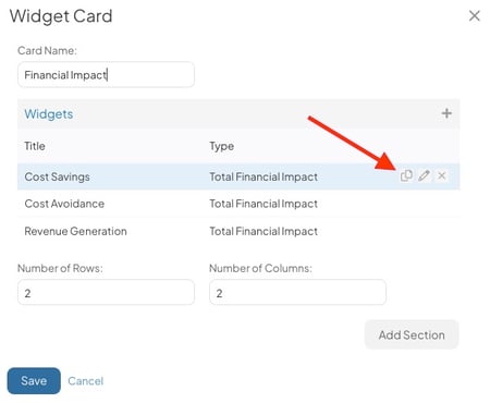
Pro Tip: You can only copy a Widget to the same Card. You cannot copy Widgets between separate Cards.