![]() Warning: Your organization must have Charts enabled on at least one Template to perform the actions on this support page. Contact your Customer Success Manager if you'd like to start using Charts.
Warning: Your organization must have Charts enabled on at least one Template to perform the actions on this support page. Contact your Customer Success Manager if you'd like to start using Charts.
Threshold Charts are used to track when you are above or below a threshold or a series of thresholds. They can be a great tool if you have a metric that you want to track when you are above/below a baseline/goal.
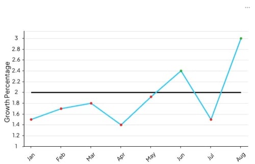
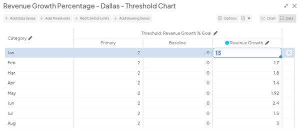
Example of a Threshold Chart. It helps you visualize when the Growth Percentage exceeds or misses the baseline threshold.
/Ofie/Ofie%20Profile%20Pic.png?width=50&height=50&name=Ofie%20Profile%20Pic.png) Pro Tip: Adding a Chart Thumbnail column to a List of Charts is a great way to visualize Charts without opening each Item individually. Check out our support page on customizing Card columns to learn how.
Pro Tip: Adding a Chart Thumbnail column to a List of Charts is a great way to visualize Charts without opening each Item individually. Check out our support page on customizing Card columns to learn how.
Who can edit a Threshold Chart?
Only the following people can edit a Chart's Details or its data:
- Anyone on the Chart's Team except for Followers or Participants.
- Anyone with the “Edit” permission for Items in the Chart's Location(s).
![]() Pro Tip: For more information on Team Roles (like Authors, Facilitators, Participants, and more!) check out this article.
Pro Tip: For more information on Team Roles (like Authors, Facilitators, Participants, and more!) check out this article.
Edit a Threshold Chart's Details
A Chart's Details consist of its non-data elements, including:
- Fields and Attributes
- Its Parent — the Item under which the Chart is nested
- Other settings such as whether or not the Chart should be private or be granted Honor Roll may be available depending on how your organization has configured its Charts and your own permissions within the system.
To edit a Chart's Details, open the Chart with which you want to work, then:
- Click Actions in the top right corner of the page.

- Click Edit Details in the resulting drop-down menu.
- Update any of the aforementioned elements.
- Click Save.
Enter Data for a Threshold Chart
You will use the data entry window to enter data for your Chart. A Chart's data includes not only the individual data points but also how those data points are displayed.
To start entering data, open the Chart with which you want to work, then:
- Select the Add Data button at the top right of the Chart Panel.
- The Chart's data entry window will open. By default, Charts are Bar/Line Charts. After at least one Threshold is added, it becomes a Threshold Chart.

In the data entry window, you can:
- Decide whether the Chart will use dates or categories
- Add a Threshold series
- Add a data series
- Edit existing data series
- Delete existing data series
- Add data rows
- Delete data rows
- Add and update data points
- Export data
- Import data
Switch between Date or Category
A Threshold Chart's horizontal axis can be either date-based or category-based. By default, a new Threshold Chart will use dates.
To change which is used, open the Chart's Edit Data window as described above, then:
- Click the pencil icon next to "Date" or "Category."

- In the resulting window, click either the Date or Category radio button to make your selection.
- If you select "Category," click Save.
- If you select "Date," additional configuration options will appear.
- The Use exact dates entered checkbox: When this box is checked, the Chart will display the exact dates entered. When this box is unchecked, the Chart will automatically calculate the best dates to display to create an even interval between the dates entered.
- The Show time on Chart checkbox: When this box is checked, the date and time for each data point will be displayed on the Chart. When this box is unchecked, only the date will be shown for each data point.
- Click Save.
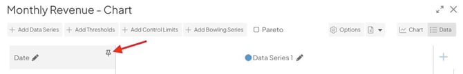
Pro Tip: If your Chart includes many Data Series, pin the Category or Date column so it stays visible while you scroll in the Chart Edit window. To do this, hover over the column and click the pin icon.
Add a New Threshold Series
A Threshold series consists of one to four thresholds — meaningful goals to which data is compared.
To create a new Threshold series, open the Chart's Edit Data window as described above, then click Add Thresholds. The "Add Threshold" window will open:
- Name (required): The name will be used to identify this series.
- Description: Enter an optional description in this field. The description will appear when hovering over the name of the series on both the Edit Data window and on the Chart's legend.
- The Shared Series checkbox: Check this box to turn this series into a Shared Series and mirror a Threshold Series from another Chart. Shared Series automatically reflect updates made to the original series, meaning Threshold and Baseline values cannot be edited directly on this Chart.
If checked, the additional fields will appear:
- Chart: Search for and select the Chart containing the series you want to mirror. After selecting a Chart, the Series field will become available.
- Series: Select the specific Threshold Series you want to mirror from the chosen Chart. Only Threshold Series will be available options.
After selecting a Shared Series, most series settings will be inherited from the original series and can no longer be edited on this Chart. Only Format and Annotation Appearance settings remain editable locally.
- Format (required): Expand the drop-down to choose in which format you want data in this to be displayed. Once you've made a choice, the predefined format will appear in the field. Edit that predefined format to configure the appearance of this series's data further.
- Do you want your data to be above or below the Thresholds (required): Expand the drop-down to choose whether a Threshold should be considered "met" if data points lie below it or above it.
- Color of data points when no Threshold is met: Click inside the color code field to open the color picker, choose in which color a data point that meets no Threshold will be displayed, then click Save on the color picker.
- Under the "First Threshold" header:
- Title: The title will be used to identify this Threshold.
- Color of data points when this Threshold is met: Click inside the color code field to open the color picker, choose in which color a data point that meets the First Threshold will be displayed, then click Save on the color picker.
- The Flag if Threshold is not met checkbox: When this box is checked, a notification will be added to this Chart whenever the most recent data point does not meet this Threshold.
- Click the Appearance subheader to open that section:
- Line Color: Click inside the color code field to open the color picker, choose in which color this Threshold will be displayed, then click Save on the color picker.
- The Show Markers checkbox: When this box is checked, a round marker will appear at each data point on the Threshold's line on the Chart.
- The Show Values checkbox: When this box is checked, the value of each data point on this Threshold will appear by its line on the Chart.
![]() Pro Tip: "Show Markers" or "Show Values" can be enabled. They cannot both be enabled for the same series.
Pro Tip: "Show Markers" or "Show Values" can be enabled. They cannot both be enabled for the same series.
-
-
- The Send to Back checkbox: When this box is checked, this series's line will be arranged behind any other series on the Chart.
- The Dashed Line checkbox: When this box is checked, this series will be displayed as a dashed line rather than a solid line.
- The Second Threshold, Third Threshold, and Baseline Threshold checkboxes: Check any of these boxes to add the corresponding Thresholds. Repeat the above process for each one added.
- Click the Annotation Appearance header to open that section.
- Click inside the color code field to open the color picker, choose in which color Annotations on this series will be displayed, then click Save on the color picker.
-
- Click Save to create the Threshold series and return to the Edit Data window or click Save & Add Data Series to create the Threshold series and immediately open the "Add Data Series" window.
Pro Tip: When you see your Threshold Chart in an Item List, it will have a checkmark icon beside its title color-coded according to which Threshold is currently met. If no Thresholds are met, it will have an exclamation point icon. This will give you more data visibility without needing to open the Chart itself.

Add a Data Series
A data series consists of the data which will be compared to the Thresholds.
When you add data to a Chart for the first time, there will be a blank data series column you can use to enter data immediately.

- Click into each cell and enter a value.
- Select the pencil icon to edit the data series. You can make changes such as updating the data series' color and whether it appears as a bar or a line.
There are two ways to add a new data series to your Chart.
- You can select the + button to the right of your existing data series. A new column will appear, and you can start entering data immediately.

- Or, you can select Add Data Series. The “Add Data Series” window will open, and you can enter the new data series settings before entering the data itself.

In the Add Data Series window or Edit Data Series window (if you are updating an existing Data Series), you can update the following settings:
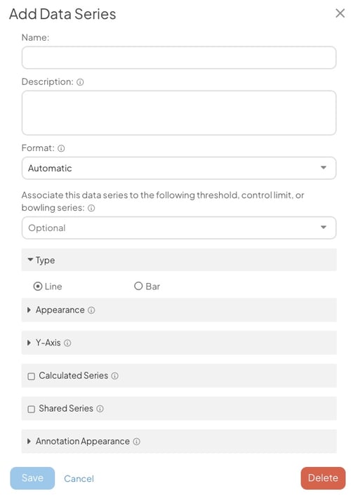
- Name (required): The name will be used to identify this series.
- Description: Enter an optional description in this field. The description will appear when hovering over the name of the series on both the Edit Data window and on the Chart's legend.
- Format (required): Expand the drop-down to choose in which format you want data in this to be displayed. Once you've made a choice, the predefined format will appear in the field. Edit that predefined format to configure the appearance of this series's data further.
- Associate this data series to the following threshold, control limit, or bowling series: Expand the drop-down to choose with which of the Chart's Threshold series this data series will be associated.
Pro Tip: You can also use click and drag on the Chart Edit window to associate a data series with a Threshold, Control Limit, or Bowling Series.
- Under the Type header:
- Click either the Line or Bar radio button to decide whether this series should be displayed as a line or as a bar.
- Click the Appearance header to open that section. The options shown here will be largely determined by your choice of line or bar above.
- If this is a line data series:
- Bar/Line Color: Click inside the color code field to open the color picker, choose in which color this series will be displayed, then click Save on the color picker.
- Line Width: The value (1–10) entered here will determine the width of this series's line on the Chart.
- The Show Markers checkbox: When this box is checked, a round marker will appear at each data point on the series's line on the Chart.
- The Show Values checkbox: When this box is checked, the value of each data point on this series will appear by its line on the Chart.
- If this is a line data series:
![]() Pro Tip: "Show Markers" or "Show Values" can be enabled. They cannot both be enabled for the same series.
Pro Tip: "Show Markers" or "Show Values" can be enabled. They cannot both be enabled for the same series.
-
-
- The Send to Back checkbox: When this box is checked, this series's line will be arranged behind any other series on the Chart.
- The Dashed Line checkbox: When this box is checked, this series will be displayed as a dashed line rather than a solid line.
- The Fill checkbox: When this box is checked, the space beneath the series's line will be filled in on the Chart. If enabled, the following options will appear beneath the checkbox:
- Fill Color: Click inside the color code field to open the color picker, choose in which the fill for this series will be displayed, then click Save on the color picker.
- Fill Opacity: Expand the drop-down to choose with what opacity you want the fill to be displayed.
- If this is a bar series:
- Bar/Line Color: Click inside the color code field to open the color picker, choose in which color this series will be displayed, then click Save on the color picker.
- The Show Values checkbox: When this box is checked, the value of each data point on this series will appear by its bar on the Chart.
-
- Click the Y-Axis header to open that section.
- Click either the Left or Right radio button to decide whether Y-axis for this series should be displayed on the left or right side of the Chart.
- The Calculated Series checkbox: Check this box to turn this series into a Calculated series. Such a series will calculate the sum, difference, average, percent, percent change, product, or quotient of other data series currently on this Chart. If checked, the "Shared Series" header will disappear and a new field will appear:
- Operator: Expand the drop-down to choose which operator the Calculated series will use. Depending on the operator chosen, additional required fields will appear.
- If Sum, Average, or Multiply are selected:
- Series: Expand the drop-down to select every data series that should be used in this calculation.
- If Difference is selected:
- Series to subtract from: Expand the drop-down to select the data series from which the other data should be subtracted.
- Series to subtract: Expand the drop-down to select every data series that should be subtracted.
- If Percent or Divide are selected:
- Numerator Series: Expand the drop-down to select the data series that should act as the numerator.
- Denominator Series: Expand the drop-down to select the data series that should act as the denominator.
- If Percent Change is selected:
- Baseline or Original (% change from): Expand the drop-down to select the data series that should act as the baseline value.
- Actual or Current: Expand the drop-down to select the data series that should act as the current value.
- If Sum, Average, or Multiply are selected:
- Operator: Expand the drop-down to choose which operator the Calculated series will use. Depending on the operator chosen, additional required fields will appear.
- The Shared Series checkbox: Check this box to turn this series into a Shared series — a series that is mirrored from another Chart. The data on such a series will not be editable on this Chart but will reflect updates made to the data series on the original Chart. If checked, the additional fields will appear:
- Chart: Use this field to search for the Chart which contains the series you want to have shared. Once you've selected a Chart, the next field will be enabled.
- Series: Expand the drop-down to select which data series from the specified Chart you would like to add.
![]() Warning: Only data series can be shared across Charts. You cannot share a Threshold, Control Limit, or Bowling Series.
Warning: Only data series can be shared across Charts. You cannot share a Threshold, Control Limit, or Bowling Series.
- Click the Annotation Appearance header to open that section.
- Click inside the color code field to open the color picker, choose in which color Annotations on this series will be displayed, then click Save on the color picker.
- Click Save to create the data series and return to the Edit Data window.
- Repeat this process for any additional data series you need to add.
Edit an existing series
To edit an existing series, open the Chart's Edit Data window as described above, then:
- Click the pencil icon next to the series's name. The "Edit Series" window will open.

- Make any changes necessary as previously described.
- Click Save to update the data series and return to the Edit Data window.
- Click Save to update the Chart.
Pro Tip: If you only need to edit the name of a data series, you can in-line edit the title. Just select the title, enter your update, and select Save.
Delete an existing series
To delete an existing series, open the Chart's Edit Data window as described above, then:
- Click the pencil icon next to the series's name. The "Edit Series" window will open.
- Click Delete. The "Edit Series" window will close and the series will no longer appear on the Edit Data window.
- Click Save to update the Chart.
Add rows
Once at least one series has been added to the Chart, you will be able to add rows. To do so, open the Chart's Edit Data window as described above, then:
- To add a single row, click Add Row.
- To add multiple rows at once, click Build Multi Rows. A new window will open so that you can specify how many rows will be added. The options on this window will differ based on whether the Chart is using dates or categories.
- If using dates:
- Start Date: Enter the date of the first row to be added.
- End Date: Enter the date of the last row to be added.
- Step Unit: Expand the drop-down to choose whether a row should be added for each day, each week, or each month between those two dates.
- Click Save.
- If using categories:
- Row Count: Enter the number of rows that should be added.
- Click Save.
- If using dates:
![]() Pro Tip: Threshold values are often the same for every row in a Chart. Save time by adding any Thresholds to the first row before clicking Build Multi Rows. The values will be copied into each new row and you won't need to enter them by hand!
Pro Tip: Threshold values are often the same for every row in a Chart. Save time by adding any Thresholds to the first row before clicking Build Multi Rows. The values will be copied into each new row and you won't need to enter them by hand!
- Once rows have been added, click the date or category field for each one to change its date or name.
- Click Save to update the Chart.
Pro Tip: When you are editing the bottom row of chart data, you can add a new row by selecting "enter" on your keyboard.
Delete rows
To delete an existing row, open the Chart's Edit Data window as described above, then:
- Hover over the row you want to delete so that it's highlighted blue.
- Click the x button that appears to its right. The row will disappear from the Edit Data window.
- Click Save to update the Chart.
Add and edit data
Once rows have been added, individual data points can be entered. To do so, open the Chart's Edit Data window as described above, then:
- Click inside the appropriate column and row intersection. The selected cell will have a blue outline.
- Enter the desired value.
- Repeat this step for every data point that must be added.
- Select "enter" on your keyboard to continue entering data in the same column.
- You can navigate between cells using the arrow keys or "tab" key on your keyboard.
- Click Save to update the Chart.
Pro Tip: When you select a cell, there will be a blue dot in the bottom right corner. Double-click the blue dot to copy the cell's value to all remaining cells in the column. This is a great way to quickly enter the goal or threshold value for all data points in the series.
Export the Chart's data
To export a Chart's data, open the Chart's Edit Data window as described above, then:
- Click the Excel File icon.

- Click Download in the resulting drop-down.
- If your Chart is using dates, you will need to select a Time Zone and then click Download in the resulting window.
Import data into a Chart
To import data into a Chart, open the Chart's Edit Data window as described above, then:
- Click the Excel File icon.
- Click Upload in the resulting drop-down.
- The "Chart Data Import" window will open:
- If your Chart is using dates, you will need to select a Time Zone.
- Either drag the file you want to import onto the resulting window or click the window and choose the correct file from your computer.
- A confirmation screen will appear with details about your import. Click Ok, got it.
![]() For more information on importing data into a Chart, check out this article.
For more information on importing data into a Chart, check out this article.
For information on importing data for multiple Charts at once, check out this article.
Everything else!
![]() For information on working with a Chart's advanced configuration options, refer to this article.
For information on working with a Chart's advanced configuration options, refer to this article.
For information on Threshold Chart Goals, refer to this article.