
Use the advanced Chart options to change your Chart's goal calculation, customize the appearance of its axes, edit bar settings, and hide data series and date ranges.
![]() REQUIRED: The Chart Module is required to perform the functions on this support page. Reach out to your Customer Success Manager to enable Charts for your organization.
REQUIRED: The Chart Module is required to perform the functions on this support page. Reach out to your Customer Success Manager to enable Charts for your organization.
A Chart's advanced options give you even more control over how your Charts should look and how data should be displayed. Depending on which type of Chart you're working with, the following can be configured:
- The goal of a Threshold or Bowling Chart
- The position of the legend
- The appearance of the X-Axis
- The appearance of any bars
- The appearance of the Left Y-Axis
- The appearance of the Right Y-Axis
- The visible date range
- The visible series
Who can edit a Chart?
Only the following people can edit a Chart's Details or its data:
- Anyone on the Chart's Team except for Followers or Participants.
- Anyone with the “Edit” permission for Items in the Chart's Location(s).
![]() For more information on Team Roles (like Authors, Facilitators, Participants, and more!) check out this article.
For more information on Team Roles (like Authors, Facilitators, Participants, and more!) check out this article.
Working with a Chart's advanced options
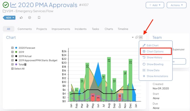
To edit a Chart's advanced options, open the Chart with which you want to work, then:
- Select the ellipsis icon at the top right of the Chart Panel.
- In the resulting drop-down, select Chart Options.
![]() If you need to build out your Chart in its entirety, check out the articles for your type of Chart: Threshold, Control Limit, Bowling, Bar/Line, or Pareto. If your Chart is already built and you just need to work with the advanced options, proceed.
If you need to build out your Chart in its entirety, check out the articles for your type of Chart: Threshold, Control Limit, Bowling, Bar/Line, or Pareto. If your Chart is already built and you just need to work with the advanced options, proceed.
- In the Chart Options window.
- Goal Series — This option will only appear for Threshold and Bowling Charts which have had at least one data series associated with a Threshold or Bowling series.
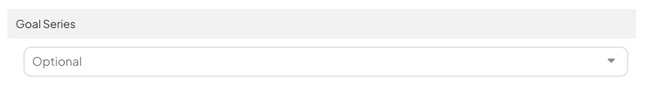
- Expand the drop-down to choose which data series should be used to calculate the goal percentage.
- Goal Series — This option will only appear for Threshold and Bowling Charts which have had at least one data series associated with a Threshold or Bowling series.
![]() For more information on Threshold and Bowling Chart Goals —what they are and how they work — check out this article.
For more information on Threshold and Bowling Chart Goals —what they are and how they work — check out this article.
-
- Under the Visualization header:
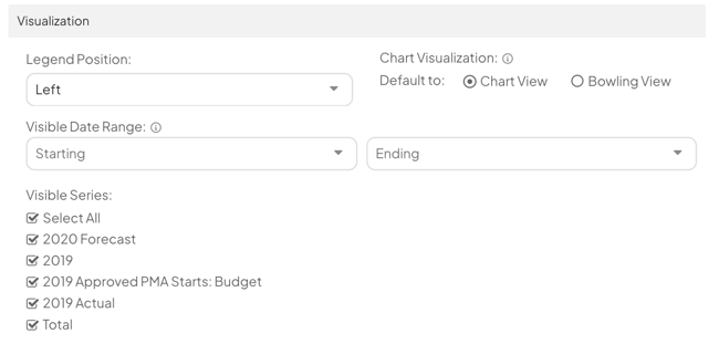
- Legend Position: Expand the drop-down to choose where the legend should appear on the Chart — above, below, to the left, or to the right.
- Changes made to this section will not affect the appearance of a Chart's Bowling view.
- Chart Visualization: Select whether you want thumbnails for your Chart to Chart View or Bowling View. Chart thumbnails appear in the Detail View of Item Lists.
- Visible Date Range — Changes made to this section will not affect the appearance of a Chart that uses categories instead of dates.
- Starting: Data preceding the date entered here will not be shown on the Chart by default, but a "Toggle Date Range" option will appear by the Chart's legend. Clicking "Toggle Date Range" will toggle the date range filter on and off.
- Ending: Data from after the date entered here will not be shown on the Chart by default, but a "Toggle Date Range" option will appear by the Chart's legend. Clicking "Toggle Date Range" will toggle the date range filter on and off.
- Visible Series
- All data series on the Chart will be listed. When the box alongside a series is unchecked, that series's data will no longer be shown on the Chart by default, but a "Show Series" option will appear by the Chart's legend. Clicking "Show Series" will toggle the series filter on and off.
- Legend Position: Expand the drop-down to choose where the legend should appear on the Chart — above, below, to the left, or to the right.
- Under the Visualization header:
-
- Under the X-Axis header:
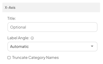
- Title: The title will appear under the x-axis on the Chart.
- Label Angle: Use the drop-down to pick how you want the x-axis labels to be visualized. Your options are:
- Automatic: If there are 0 to 12 labels on your x-axis, the labels will be written diagonally. If there are 13 or more labels on your x-axis, they will switch to a vertical orientation, making it clear which labels are associated with which data points even when the Chart gets more crowded.
- Diagonal: The x-axis labels will always have a diagonal orientation, making the labels easier to read.
- Vertical: The x-axis labels will always have a vertical orientation,
- Custom: When you select Custom, an additional field will appear. Use it to enter the angle at which you want the x-axis labels to appear.
- Under the X-Axis header:
-
-
- The Truncate Category Names checkbox: When this box is checked, each X-Axis category will be truncated. If enabled, a new field will appear beneath the checkbox.
- Number of Characters: The value entered here determines how many characters will be shown for each X-Axis category before the category is truncated.
- Changes made to this section will not affect the appearance of a Chart's Bowling view.
- The Truncate Category Names checkbox: When this box is checked, each X-Axis category will be truncated. If enabled, a new field will appear beneath the checkbox.
-
-
- Under the Bar Settings header:
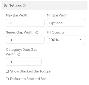
- Max Bar Width: The value (1-100) entered here determines the maximum width of any bars on this Chart.
- Min Bar Width: The value (1-100) entered here determines the minimum width of any bars on this Chart.
- Series Gap Width: The value (0-100) entered here determines the minimum gap width between any bars within groups of series on the Chart.
- Fill Opacity: Expand the drop-down to choose the opacity of any bars on this Chart.
- Category/Date Gap Width: The value (0-100) entered here determines the minimum gap width of bars between groups of series on the Chart.
- The Show Stacked Bar Toggle checkbox: When this box is checked, a "Show Stacked" option will appear by the Chart's legend. Clicking "Show Stacked" will toggle the stacked bar visualization on and off.
- The Default to Stacked Bar checkbox: When this box is checked, the stacked bar visualization will become the default view.
- Changes made to this section will not affect the appearance of any data series displayed as a line nor that of a Chart's Bowling view.
- Under the Bar Settings header:
-
- Under the Left Y-Axis header:
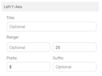
- Title: The title will appear alongside the Left Y-Axis on the Chart.
- Range: The upper and lower limits entered here will force this axis to only show this range, rather than automatically growing or shrinking to fit the Chart's data points.
- Prefix: Characters entered in this field will appear to the left of all numbers on the Left Y-Axis. This lets you include special characters (such as "$").
- Suffix: Characters entered in this field will appear to the right of all numbers on the Left Y-Axis. This lets you include special characters (such as "%").
- This section will not be available on Pareto Charts; changes made to this section will not affect the appearance of a Chart's Bowling view.
- Under the Right Y-Axis header:
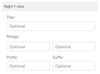
- Title: The title will appear alongside the Right Y-Axis on the Chart.
- Range: The upper and lower limits entered here will force this axis to only show this range, rather than automatically growing or shrinking to fit the Chart's data points.
- Prefix: Characters entered in this field will appear to the left of all numbers on the Right Y-Axis. This lets you include special characters (such as "$").
- Suffix: Characters entered in this field will appear to the right of all numbers on the Right Y-Axis. This lets you include special characters (such as "%").
- This section will not be available on Pareto Charts; changes made to this section will not affect the appearance of a Chart's Bowling view.
- Under the Left Y-Axis header:
- Select Save to save your changes.
/Ofie/Ofie%20Profile%20Pic.png?width=50&height=50&name=Ofie%20Profile%20Pic.png) Pro Tip: Making changes to the Visible Series and Visible Date Ranges in the Edit menu of a Chart only affects the Item, not the Card. To hide data series or change date ranges on a Chart Card, you must edit the Card's view.
Pro Tip: Making changes to the Visible Series and Visible Date Ranges in the Edit menu of a Chart only affects the Item, not the Card. To hide data series or change date ranges on a Chart Card, you must edit the Card's view.