![]() Important: Reach out to your Customer Success Manager if you're interested in this module.
Important: Reach out to your Customer Success Manager if you're interested in this module.
The Chart Module allows users to create Charts directly within KaiNexus, as well as import existing Chart data that is already a part of your organization's improvement process.
With the Charts Module, you can visualize your data with a Bar, Line, Control, Bowling, Threshold, or Pareto Chart in KaiNexus.
What is a Chart?
Charts display data in a graphical format to help you visualize relationships between your data. When you create a Chart in KaiNexus, you can select from Bar, Line, Control, Bowling, Threshold, and Pareto.
With the Charts Module enabled you have the ability to:
- Create Charts directly within KaiNexus. KaiNexus supports the following Chart types:
- Import existing data using the Multi-Chart Importer
- Add Chart Cards to a Board
- Add Chart Goal Widgets to a Board
- Display Chart Thumbnails in Item Lists
Types of Charts
Bar and Line Charts
A Bar Chart is a type of Chart that displays data as rectangular bars with heights proportional to the data's value.
A Line Chart is a type of Chart that displays information as a series of data points connected by line segments.
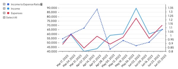
Example of a Line Chart.
![]() For more information on working with Bar and Line Charts, check out this support article.
For more information on working with Bar and Line Charts, check out this support article.
Control Charts
Control Charts are used to study how a process changes over time. They include a center line (the process mean or average), an upper control limit, and a lower control limit. The control limits, determined from historical data, represent the process variation and show what the typical or expected range of variation is.
By comparing current data to these historical data lines, you can draw conclusions about whether the process variation is consistent (in control) or unpredictable (out of control, affected by special causes of variation).
When the data is outside of the control limits:
-
Notifications may be sent to the Chart's Team (depending on how the Control Limit series is configured).
-
A red exclamation point will be displayed next to the Chart’s name on any list of Charts.
Example of a Control Chart.
![]() For more information on working with Control Charts, check out this support article.
For more information on working with Control Charts, check out this support article.
Bowling Charts
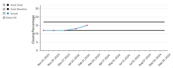
A Bowling Chart is a simple, visual way to monitor Key Performance Indicators (KPIs) or policy deployment objectives. They make it easier to check in on how often your goals were met or missed.
By comparing your actual metrics to your target metrics each month, you can manage performance objectives and adjust your processes to help your actual metrics reach your target.
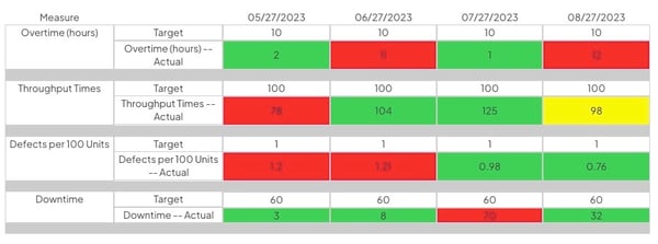
Example of a Bowling Chart.
![]() For more information on working with Bowling Charts, check out this support article.
For more information on working with Bowling Charts, check out this support article.
Threshold Charts
Threshold Charts are used to track when you are above or below a threshold or a series of thresholds. Essentially, Threshold Charts are a variation of a Bar Chart with an associated goal. Displaying a static goal line in a Chart can help you determine which data points are either below or above a significant value.
For example, you can create a line chart for server processing time to help you monitor the performance of an important database in your network environment. By adding a threshold line that defines a service level agreement (SLA) boundary of acceptable processing time, you can see when database performance is slowing down and address the issue.
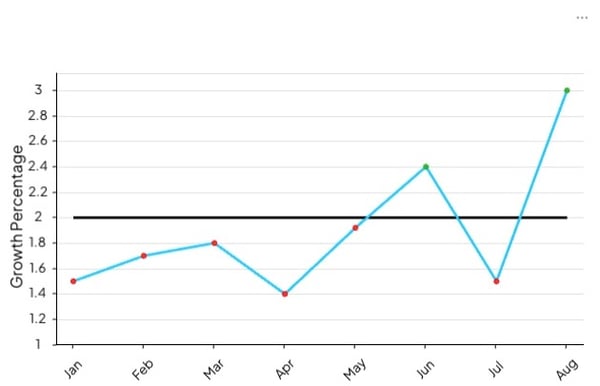
Example of a Threshold Chart.
![]() For more information on working with Threshold Charts, check out this support article.
For more information on working with Threshold Charts, check out this support article.
Pareto Chart
A Pareto Chart is a vertical bar graph in which values are displayed in decreasing order of relative frequency from left to right. The taller the bar on the Chart, the greater the cumulative effect that variable has on a given system.
- The height of the bar represents the frequency or cost of the problem.
- The bars are presented in descending order (from tallest to shortest).
- A line representing the cumulative percentage of each category is automatically added and recalculated each time the data is updated.
By comparing the data in the bars with the cumulative percentage line, you can determine which defects to prioritize in order to observe the greatest overall improvement.
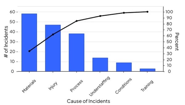
Example of a Pareto Chart.
![]() For more information on working with Pareto Charts, check out this support article.
For more information on working with Pareto Charts, check out this support article.