The Gantt View is a way of showing Items over time. With this View, each Item is represented by a bar, the position and length of which reflect its Start Date, duration, and Due Date.
Like the Tree View, the Gantt View displays the hierarchy of Items — how they're nested under one another — and lets you add, remove, and rearrange columns to control which information is displayed for each Item.
How it works
Gantt View Columns
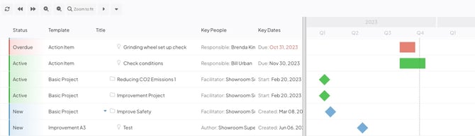
The left side of the Gantt view is an Item List with customizable columns. By default, the following columns will appear:
- Status: The status will be written out and will also be indicated by the color of the bar next to each Item.
- Template: The Template from which the Item was created is displayed.
- Title: The Item's title is displayed.
- Key People: The most important team role (as determined by the Item's Team Type and current status) will be listed along with all the users in that role.
- Key Dates: Each Item's last updated date and one additional key date will be listed. The additional key date is chosen based on the Item's current status. For example, active Items' due dates and completed Items' completed dates will be shown.
/Ofie/Ofie%20Profile%20Pic.png?width=50&height=50&name=Ofie%20Profile%20Pic.png) Pro Tip: If you want to change which columns appear, edit the List View. If you are an administrator for your organization, you can also customize the default columns that appear on new Item Lists.
Pro Tip: If you want to change which columns appear, edit the List View. If you are an administrator for your organization, you can also customize the default columns that appear on new Item Lists.
Primary results and children
Items that meet the criteria in your Item Filter are called "primary results." The number of primary results in your List will be displayed at the top of the List.
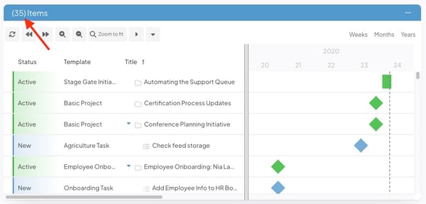
Example of a Gantt View List with 35 primary results.
Gantt View also displays the child Items nested beneath your primary results, making it a great tool for viewing project timelines. This means that your Gantt View List will likely have more Items than counted in the primary results.
Note: If an Item is a primary result and a child of another primary result Item, it will only appear one time in your Item List. It will be counted in the number of primary results in your List and be located in the nesting structure beneath its parent.
A limitation of Gantt View Lists is that they do not have multiple pages, meaning that some Items may be excluded if they do not fit on the first page of results.
By default, Gantt View only shows the first 50 primary results (Items that meet your filter requirements) and up to 250 of their children. If there are more than 50 primary results or if the primary results have more than 250 children, a warning icon will appear at the top of the List, indicating that some Items are being excluded.
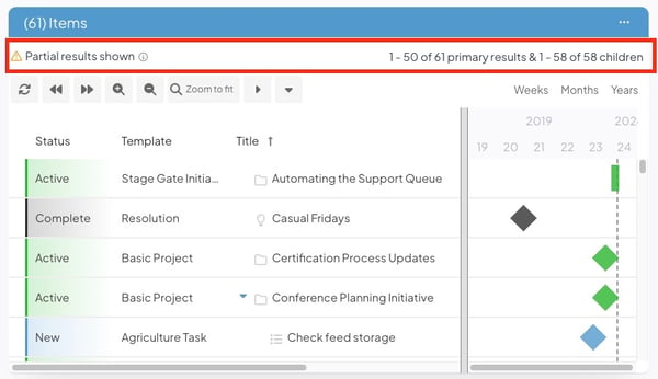
Example warning message you'll receive if the number of Items in your List exceeds the limits. The message will inform you how many primary results and children are included in the List. In this example, you can see that the first 50 out of 61 total primary results appear in the List and that no children are being excluded.
Pro Tip: You can change how many primary results are included in your Gantt View List by adjusting the View Options in the Item Filter. Jump ahead in this article to learn how.
As a best practice, we recommend adjusting your Item List filter to ensure your List doesn't have more primary results than can fit on one page.
Gantt View Timeline
The right side of the Gantt View is a visual representation of the listed Items over time, in which each Item is represented by a bar or diamond.
- The color of the bar or diamond is determined by the Item's current status.
- The position and length of the bar are determined by the Item's dates:
- If the Item has a start date, the bar or diamond will begin at that date. If it doesn't, the bar or diamond will begin at the Item's Create Date.
- If the Item has neither a due date nor a Complete Date, it will be represented by a diamond.
- If the Item has a Complete Date, it will be represented by a bar that ends on the Complete Date. If the Item has a due date but not Complete Date, it will be represented by a bar that ends at the due date.
- The position and length of the bar reflect its Create Date or Start Date, duration, and Due Date or Complete Date.
- If an Item doesn't have a Due Date or Complete Date, it will be represented by a diamond at its Create Date or Start Date.
- The vertical dashed line going down the length of the Gantt chart indicates the current date.
Working with the Gantt View
- Items that meet the list's filter requirements will appear at the top level of the list. If an Item has other Items nested beneath it, there will be a right caret icon to its left. Click that icon to see the Items nested under it.
 An Item with other Items nested under it is called a "parent." Those nested Items are its "children." By default, all of a parent's children are included in the Gantt View, though the list can be filtered such that only certain children appear.
- When in the Gantt View, click any of the listed Items or the Item's bar or diamond to open it.
- If any of the listed Items are dependent on another, a blue line and arrow will connect the two Items' bars. Hover over the line and a tooltip listing the two Items will appear.
- Quickly edit an Item. You can edit Items by clicking on the specific column of data that you want to update, by clicking the ellipsis icon that appears when hovering over the Item you want to update, or by right-clicking the Item you want to update.
For more information on using the editing Items directly from a list, check out this article.
- To open an Item in a new tab on your browser, right-click its name, then click Open in a new tab in the resulting drop-down menu.
- To copy the direct link to an Item, right-click its name, then click Copy Link. The link will be copied to your clipboard.
Configuring the Gantt View
To configure how Items are represented in the Gantt View:
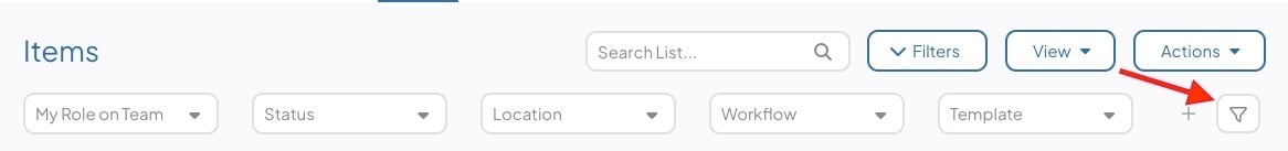
- Click the filter icon near the top of the list. If you do not see this option, you may need to first click Filters to expand the list's filters.
- In the resulting window:
- Click the View Options header to expand it.
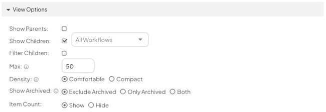
- The Show Parents checkbox: When enabled, the parent of any Items that meet the filter requirements will be included on the list even if that parent does not meet the filter requirements itself.
- The Show Children checkbox: When enabled, the children of any Items that meet the filter requirements will be included on the list even if those children do not meet the filter requirements themselves.
- By default, when this checkbox is enabled all children will be included on the list. To only include children of certain workflows, expand the Workflows drop-down to the right of the checkbox and select the workflows that should be included.
- The Filter Children checkbox: When enabled, a filter icon will appear next to the checkbox that you can use to control which children are included on the list.
- Click the filter icon to open a new Item Filter window from which you can filter the list of children.
- Max: Enter the number of primary result Items to appear in your List. Because Gantt View only has one page of results, this will determine how many primary results your List can hold before additional Items are excluded.
- By default, 50 primary result Items will appear.
- There is a maximum limit of 250.
- Any number above 50 could potentially increase the load time for your Item List.
- Density: Click one of the following radio buttons to pick the list's appearance.
- Comfortable: When selected, the rows on the list will have more whitespace, making it easier to read.
- Compact: When selected, the rows on the list will have less whitespace, allowing for more data to be visible.
- Click the View Options header to expand it.
-
-
- Show Archived: Click one of the following radio buttons to decide whether archived Items should be included on the list.
-
-
-
-
- Exclude Archived: When selected, no archived Items will be included on the list.
-
-
-
-
-
- Only Archived: When selected, no unarchived Items will be included on the list.
-
-
-
-
-
- Both: When selected, archived Items and unarchived Items will be included on the list.
- Item Count (Card-only setting): Choose whether you want to Show or Hide the number of Items included in the List on the Card's header.
-
-
-
- Click Save.
Recommended Reading
- Configure an Item List's View
- Filter a list of Items
- Item list Quick Filters
- Editing Items from a list
- Managing custom lists