/Ofie/Ofie%20Profile%20Pic.png?width=50&height=50&name=Ofie%20Profile%20Pic.png) Warning: Your organization must have Charts enabled for at least one Template to perform the actions on this support page. Contact your Customer Success Manager if you'd like to start using Charts.
Warning: Your organization must have Charts enabled for at least one Template to perform the actions on this support page. Contact your Customer Success Manager if you'd like to start using Charts.
What are Charts?
Charts display data in a graphical format to help you visualize relationships between your data.
Charts are a feature that can be added to Templates, and most often, your organization will have a dedicated Chart Template. When you create a new Chart, you are creating a new Item in the system.
Types of Charts
There are five types of Charts that you can create in KaiNexus.
Bar and Line Charts
Bar and Line Charts display data as rectangular bars and data points connected by line segments.

Example of a Line Chart.
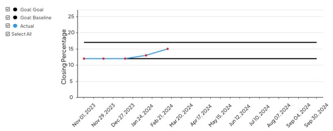
Threshold Charts
Threshold Charts are used to track when your data is above or below a custom threshold. Essentially, Threshold Charts are a variation of a Bar and Line Chart with an associated goal. Displaying a static goal line in a Chart can help you determine which data points are either below or above a significant value.

Example of a Threshold Chart.
Control Charts
Control Charts help you visualize how data changes over time and how it compares to your customized controls.
Example of a Control Chart.
Bowling Charts
Bowling Charts are a simple, visual way to monitor Key Performance Indicators (KPIs) or policy deployment objectives. They make it easier to check in on how often your goals were met or missed.

Example of a Bowling Chart.
Pareto Charts
Pareto Charts are vertical bar graphs in which values are displayed in decreasing order of relative frequency from left to right. The taller the bar on the Chart, the greater the cumulative effect that variable has on a given system.
By comparing the data in the bars with the cumulative percentage line, you can determine which defects to prioritize in order to observe the greatest overall improvement.

Example of a Pareto Chart.
Pro Tip: You determine which type of Chart you are creating during data entry. For example, adding a Bowling Series results in a Bowling Chart, and adding a Control Series makes it a Control Chart.
Creating Charts
Who can create Charts?
Who can create Charts depends on the configuration of your organization's unique Chart Template.
If you think you should be able to create a Chart, but cannot, we recommend you submit a ticket to our support team.
How to create a Chart
- Find your organization's Chart Template in the Create Button drop-down.

- Use the Create Screen to title your Chart and fill out any applicable fields.
- Select Add Data to start building your Chart.

- In the resulting window, you can enter data and decide which type of Chart you want. By default, your Chart will be a Bar and Line Chart. However, you can make other types of Charts by using the Pareto checkbox or adding Thresholds, Control Limits, and Bowling Series.

- When you select the Pareto checkbox or add a Threshold, Control Limit, or Bowling Series, the other options will disappear, helping you focus on your specific Chart Type.
- If you'd like to switch between Chart Types, uncheck the Pareto checkbox or delete all your Thresholds, Control Limits, and Bowling Series. This will revert the Chart back to a Bar and Line Chart, and the other Chart Type options will return.
- Use the following support articles to learn how to enter data for each Chart type.
- When you are finished entering data, select Save and your Chart will be created. You can return to it at any time to update data.
Recommended Reading
To learn how to update advanced Chart options such as axis and bar settings, reference the following article:
We also recommend checking out these articles next to further your Charts knowledge: