![]() Warning: Your organization must have Charts enabled for at least one Template to perform the actions on this support page. Contact your Customer Success Manager if you'd like to start using Charts.
Warning: Your organization must have Charts enabled for at least one Template to perform the actions on this support page. Contact your Customer Success Manager if you'd like to start using Charts.
A calculated data series is a series that automatically calculates the sum, difference, average, percent, percent change, product, or quotient of other data series on a Chart each time the Chart's data is saved.
This type of data series can be added to a Threshold, Control Limit, Bowling, or Bar/Line Chart — and is automatically created as part of any Pareto Chart.
Who can edit a Chart?
Only the following people can edit a Chart's Details or its data:
- Anyone on the Chart's Team except for Followers or Participants.
- Anyone with the “Edit” permission for Items in the Chart's Location(s).
![]() For more information on Team Roles (like Authors, Facilitators, Participants, and more!) check out this article.
For more information on Team Roles (like Authors, Facilitators, Participants, and more!) check out this article.
Create a calculated data series
To create a new calculated data series, open the Chart with which you want to work, then:
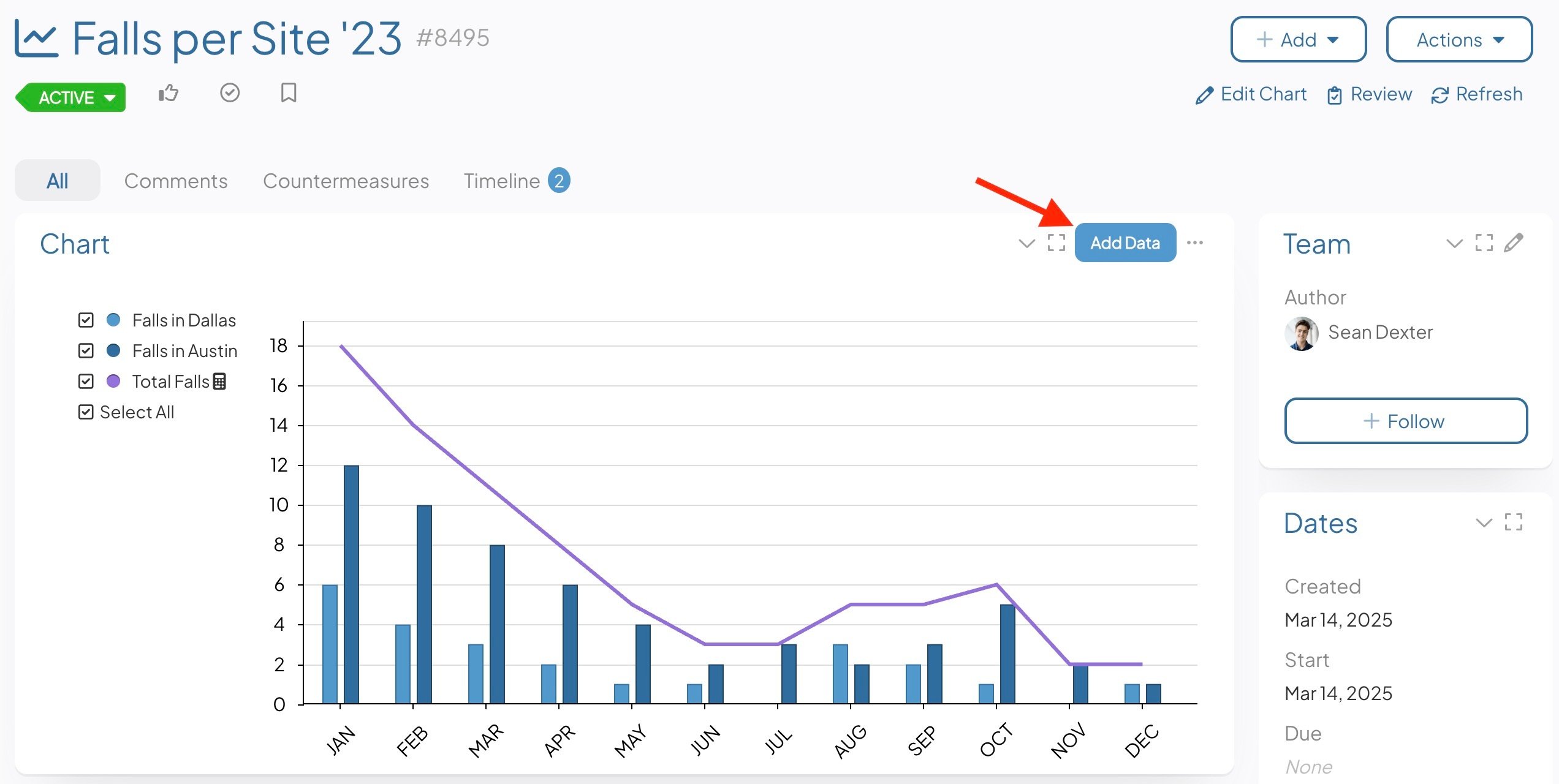
- Select the Add Data button at the top right of the Chart Panel. This opens the Chart's Edit Data window.
![]() If you need to build out your Chart in its entirety, check out the articles for your type of Chart: Threshold, Control Limit, Bowling, Bar/Line, or Pareto. If your Chart is already built and you just need to add a calculated data series, proceed.
If you need to build out your Chart in its entirety, check out the articles for your type of Chart: Threshold, Control Limit, Bowling, Bar/Line, or Pareto. If your Chart is already built and you just need to add a calculated data series, proceed.
- Click Add Data Series. The "Add Data Series" window will open:
- Name (required): The name will be used to identify this series.
- Description: Enter an optional description in this field. The description will appear when hovering over the name of the series on both the Edit Data window and on the Chart's legend.
- Format (required): Expand the drop-down to choose in which format you want data in this to be displayed. Once you've made a choice, the predefined format will appear in the field. Edit that predefined format to configure the appearance of this series's data further.
- Under the Type header:
- Click either the Line or Bar radio button to decide whether this series should be displayed as a line or as a bar.
- Click the Appearance header to open that section. The options shown here will be largely determined by your choice of line or bar above.
- If this is a line data series:
- Bar/Line Color: Click inside the color code field to open the color picker, choose in which color this series will be displayed, then click Save on the color picker.
- Line Width: The value (1–10) entered here will determine the width of this series's line on the Chart.
- The Show Markers checkbox: When this box is checked, a round marker will appear at each data point on the series's line on the Chart.
- The Show Values checkbox: When this box is checked, the value of each data point on this series will appear by its line on the Chart.
- If this is a line data series:
![]() "Show Markers" or "Show Values" can be enabled. They cannot both be enabled for the same series.
"Show Markers" or "Show Values" can be enabled. They cannot both be enabled for the same series.
-
-
-
- The Send to Back checkbox: When this box is checked, this series's line will be arranged behind any other series on the Chart.
- The Dashed Line checkbox: When this box is checked, this series will be displayed as a dashed line rather than a solid line.
- The Fill checkbox: When this box is checked, the space beneath the series's line will be filled in on the Chart. If enabled, the following options will appear beneath the checkbox:
- Fill Color: Click inside the color code field to open the color picker, choose in which the fill for this series will be displayed, then click Save on the color picker.
- Fill Opacity: Expand the drop-down to choose with what opacity you want the fill to be displayed.
- If this is a bar series:
- Bar/Line Color: Click inside the color code field to open the color picker, choose in which color this series will be displayed, then click Save on the color picker.
- The Show Values checkbox: When this box is checked, the value of each data point on this series will appear by its bar on the Chart.
-
- Click the Y-Axis header to open that section.
- Click either the Left or Right radio button to decide whether Y-axis for this series should be displayed on the left or right side of the Chart.
- The Calculated Series checkbox: Check this box to turn this series into a Calculated series. Such a series will calculate the sum, difference, average, percent, percent change, product, or quotient of other data series currently on this Chart. When checked, the "Shared Series" header will disappear and a new field will appear:
- Operator: Expand the drop-down to choose which operator the Calculated series will use. Depending on the operator chosen, additional required fields will appear.
- If Sum, Average, or Multiply are selected:
- Series: Expand the drop-down to select every data series that should be used in this calculation.
- If Difference is selected:
- Series to subtract from: Expand the drop-down to select the data series from which the other data should be subtracted.
- Series to subtract: Expand the drop-down to select every data series that should be subtracted.
- If Percent or Divide are selected:
- Numerator Series: Expand the drop-down to select the data series that should act as the numerator.
- Denominator Series: Expand the drop-down to select the data series that should act as the denominator.
- If Percent Change is selected:
- Baseline or Original (% change from): Expand the drop-down to select the data series that should act as the baseline value.
- Actual or Current: Expand the drop-down to select the data series that should act as the current value.
- If Sum, Average, or Multiply are selected:
- Operator: Expand the drop-down to choose which operator the Calculated series will use. Depending on the operator chosen, additional required fields will appear.
-
-
- Click the Annotation Appearance header to open that section.
- Click inside the color code field to open the color picker, choose in which color Annotations on this series will be displayed, then click Save on the color picker.
- Click Save to create the data series and return to the Edit Data window.
- Repeat this process for any additional data series you need to add.
- Click Save on the Edit Data window to update the Chart.
- Click the Annotation Appearance header to open that section.