The Attribute Summary Report lets you view the number of Items involving each Attribute and each Attribute Value in a bar, pie, or Pareto chart.
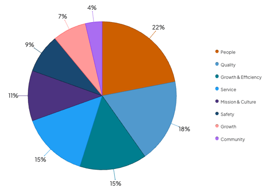
Example of an Attribute Summary in Pie view showing how often Strategic Initiative Attribute Values are used.
Who can access this Report?
Anyone with the "View Report Data" permission will be able to see this Report.
This Report can be accessed under the Attribute section of the Reports page. It can also be added as a Card on a Board.
Working with the Report
- Understand the Report's views
- Use filters to control which data are referenced by the Report
- See a list of Items referenced by the Report
- Share the Report
The views
This Report has four views. Click the name of the view you want to see to toggle between them.

- Vertical Bar: Shows the total number of Items involving each Attribute Value as a vertical bar graph.
- Toggle between Total, Statuses, and Attribute to change what type of data the Report displays.

- Total: Displays the total number of Items where each Attribute Value on the Report is populated.
- Statuses: Displays the total number of Items where each Attribute Value is populated and breaks down the data by Item Status.
- Attribute: This option lists Attributes on the X-axis instead of Attribute Values. It displays the total number of Items where the Attribute is populated and breaks down the data by how often each value is selected.
- The Report's bars can visualize up to 10 values for each Attribute. If the Attribute has more than 10 values, only the first 10 will be represented as segments within the bar.
- Sort: Expand the drop-down to select by which criterion this dataset should be ordered.
- Max: Enter the number of data points that should be represented on this graph. By default, this Report will show 15 data points, but it can be configured to show 1-50.
- Show Values: When enabled, the value of each data point will be displayed on the graph.
- Toggle between Total, Statuses, and Attribute to change what type of data the Report displays.
- Horizontal Bar: Shows the total number of Items involving each Attribute Value as a horizontal bar graph.
- Toggle between Total, Statuses, and Attribute to change what type of data the Report displays.

- Total: Displays the total number of Items where each Attribute Value on the Report is populated.
- Statuses: Displays the total number of Items where each Attribute Value is populated and breaks down the data by Item Status.
- Attribute: This option lists Attributes on the Y-axis instead of Attribute Values. It displays the total number of Items where the Attribute is populated and breaks down the data by the number of Items where each value is selected.
- The Report's bars can visualize up to 10 values for each Attribute. If the Attribute has more than 10 values, only the first 10 will be represented as segments within the bar.
- Toggle between Total, Statuses, and Attribute to change what type of data the Report displays.
-
- Sort: Expand the drop-down to select by which criterion this dataset should be ordered.
- Max: Enter the number of data points that should be represented on this graph. By default, this Report will show 15 data points, but it can be configured to show 1-50.
- Show Values: When enabled, the value of each data point will be displayed on the graph.
- Pie: Shows the number of Items involving each Attribute Value as a Pie chart.
- The slices of the Pie chart will be colored based on the color configured on the Attribute value. Be sure to configure unique colors for your Attribute Values.
- Expand the Sort drop-down to select by which criterion this dataset should be ordered.
-
- Max: Enter the number of data points that should be represented on this chart. By default, this Report will show 15 data points, but it can be configured to show 1-50.
- Show Values: When selected, this checkbox displays the count for each Attribute Value slice on the Report. When unchecked, values are hidden, but you can hover over a slice to see the exact count.
- Show Percentages: When selected, this checkbox displays the percentage of the total that each slice represents on the Report. When unchecked, percentages are hidden, but you can hover over a data point to see the exact percentage.
- Pareto: Shows the number of Items involving each Attribute Value as a Pareto chart.
- Max: Enter the number of data points that should be represented on this chart. By default, this Report will show 15 data points, but it can be configured to show 1-50.
- Show Values: When enabled, the value of each data point will be displayed on the chart.
The filters
Any relevant filters in use on the main Reports screen will be automatically applied to this Report but can still be configured as needed.
- There are two date-based drop-downs. First is the "Reference Date" drop-down and second is the "Range" drop-down.

- Reference Date: Expand the drop-down to choose which type of date should be referenced by the Report. For example, select "Created in" if you want the Report to reference only those Items that were created in the specified date range.
- Range: Expand the drop-down to choose the range of dates that should be included in the Report.
- All Time removes any date range parameters.
- Custom allows you to enter any date range you want.
- Past shows you a rolling date range that counts back from the current calendar date.
- Current shows you data for the current week, month, quarter, or year.
- Last shows you data for the previous week, month, quarter, year, or multi-year period.
/Ofie/Ofie%20Profile%20Pic.png?width=50&height=50&name=Ofie%20Profile%20Pic.png) Pro Tip: The Last YTD option helps you set a date range matching the current year-to-date period but for the previous year instead. For example, if it is March 15th, 2024, and you select Last YTD, your Report will cover data from January 1st, 2023, to March 15th, 2023. This logic is also true for the Last MTD and QTD options.
Pro Tip: The Last YTD option helps you set a date range matching the current year-to-date period but for the previous year instead. For example, if it is March 15th, 2024, and you select Last YTD, your Report will cover data from January 1st, 2023, to March 15th, 2023. This logic is also true for the Last MTD and QTD options.
- Workflow: Expand the drop-down to choose which workflows should be included in the Report.
- Template: Expand the drop-down to choose which Templates should be included in the Report.
- Click the filter icon and the Item Filter window will open.

- Update the filters to control which Items are included in the Report.
- Click Save.
-
Select Originating, Responsible, or Impact to decide whether the Report should reference Items from the Originating, Responsible, or Impact Location.
- By default, both Originating and Responsible will be selected.
- If Impact is selected, both Originating and Responsible will be toggled off.
- If no Location is selected in the Location Filter or Item Filter, the Originating, Responsible, and Impact toggles will not affect Report data.
- Click the Locations panel on the left side of the Report to expand it.
- Filter the Report by Location and only Items tied to the selected Locations will be included in the Report.
- Shared Value Group: This drop-down will only appear if your organization has at least one Shared Value Group. Expand it to choose which group(s) of values should be displayed on the Report.
- The Item counts on the Report will represent the number of Items where each value was selected at least among any of the Attributes using the Shared Value Group.
- Attribute: Expand the drop-down to choose which Attribute(s) should be included in this Report.
- If you already selected a Shared Value Group, only Attributes using that Group will be available in this drop-down.
- If the selected Attribute has multiple associations, an additional Attribute Type drop-down will appear. Use this dropdown to specify whether you want to reference Items where the Attribute is used in the Item Work Panel, Impact, or AdHoc Field.
- Value: This drop-down appears when you select a Shared Value Group or Attribute and contains the associated values. By default, all of these values are included in the Report, but if you select one or more values from the drop-down, the Report will be limited to only those selections.
- The Combine Values checkbox: This checkbox is available when you select a Shared Value Group and use the Total mode. When selected, the Report will display each value in the chosen Shared Value Group only once, rather than repeating the same values for every Attribute that uses the group. Any Item where where the Shared Value appears at least once in any of the Attributes using the Shared Value Group will be included in the Item count data.

See a list of Items referenced by the Report
When in the Vertical Bar, Horizontal Bar, or Pareto views:
- Hover over a bar or bar segment to open a tooltip that lists its exact value.
- Click any bar or bar segment to open a list of all Items involving that Attribute Value.
When in the Pie view:
- Hover over any segment of the chart to open a tooltip that lists its exact value.
- Click any segment to open a list of all Items involving that Attribute Value.
Share the Report
To share the Report, select the ellipsis icon. In the resulting drop-down menu, you can export the Report as a PDF or copy it to a Board.

- Select Print/Save PDF to export the Report as a PDF. The "Print" window will open.
- Page Size: Expand the drop-down to choose your preferred page size.
- Scale: Expand the drop-down to choose the scale percentage. This allows you to fit more content on a single page. For example, selecting 50% doubles the amount of content you can fit on one page. Make sure to select "Fit to page" in your browser's print settings.
- Click either Portrait or Landscape to choose the PDF's orientation.
- Click Print.
The Location of the Report will appear on the exported PDF beneath the Report title.
- Select Copy to Board to add the Report as a Card on a Board.
- In the resulting window, select a Board. All Boards that you have permission to edit will appear as options.
- Select Copy to add the Report to your selected Board. All filters and columns included on the Report will be carried over to the Card.
- The Report Card will appear at the Board's top left corner.