The Item Curve Report lets you look for trends such as changes in slope and divergence to identify potential bottlenecks.
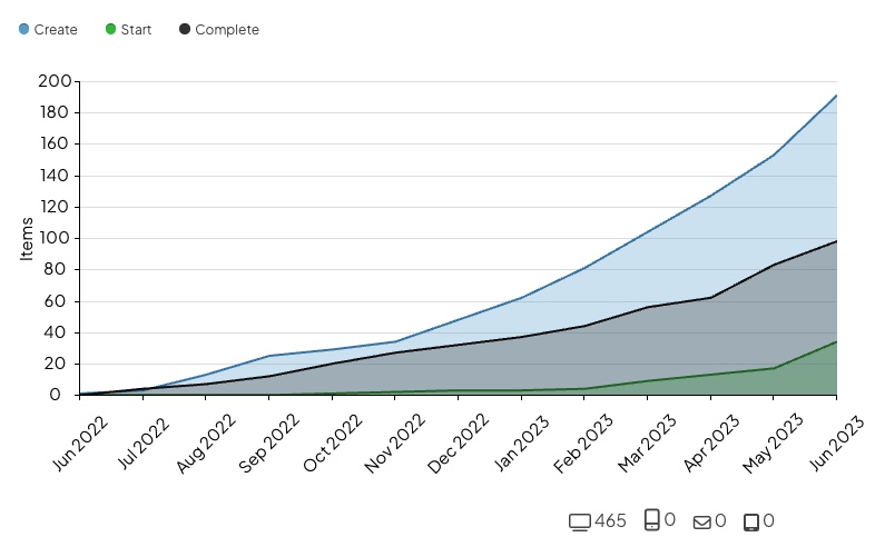
Example of Item Curve Report. Each line represents Items in a certain Status. As time progresses, you can see if the amount of Completed Items is increasing at the same rate as New and Active Items.
Who can access this Report?
Anyone with the "View Report Data" permission will be able to see this Report.
This Report can be accessed under the Activity section of the Reports page. It can also be added as a Card on a Board.
Working with the Report
- Understand the data
- Use filters to control which data are referenced by the Report
- Show Goals on the Report
- Export the Report
The data
This Report displays the number of Items created, started, and completed over time. Hover over any data point to open a tooltip that lists the number of Items it includes.
Beneath the graph, there are four icons that show how the Items included in the Report were submitted:
- The number beside the computer icon represents the number of Items that were submitted via the browser app.
- The number beside the smartphone icon represents the number of Items that were submitted via the mobile app.
- The number beside the envelope icon represents the number of Items that were submitted via email.
- The number beside the tablet icon represents the number of items that were submitted via the kiosk.
/Reports/Item%20Curve/Item%20Curve%20-%20Devices.jpeg?width=670&height=465&name=Item%20Curve%20-%20Devices.jpeg)
This Report can tell you a lot about the health of your improvement culture:
- A high slope of submissions and completions indicates a healthy improvement culture.
- An inflection point in the slope of submission and completion usually reflects a change in leadership behaviors and/or improvement processes.
- A low slope of submissions and completion is a warning sign that may indicate an unhealthy improvement culture.
- More Items being submitted than being completed may result in improvement efforts slowing, engagement decreasing, and ultimately may damage your improvement culture.
The filters
Any relevant filters in use on the main Reports screen will be automatically applied to this Report but can still be configured as needed.
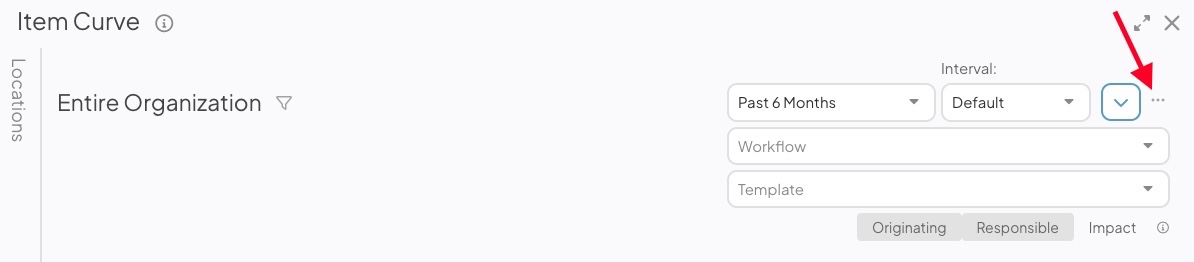
- There are two date-based drop-downs. First is the "Range" drop-down and second is the "Interval" drop-down.
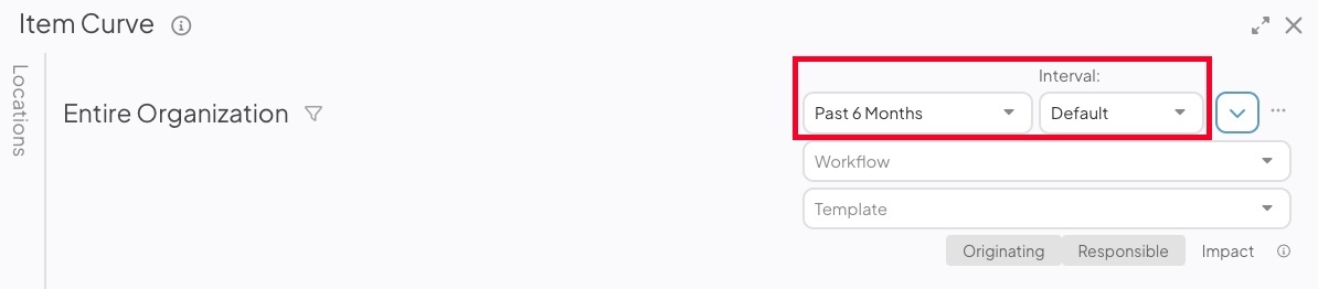
- Range: Expand the drop-down to choose the range of dates that should be included in the Report.
- All Time removes any date range parameters.
- Custom allows you to enter any date range you want.
- Past shows you a rolling date range that counts back from the current calendar date.
- Current shows you data for the current week, month, quarter, or year.
- Last shows you data for the previous week, month, quarter, year, or multi-year period.
- Range: Expand the drop-down to choose the range of dates that should be included in the Report.
/Ofie/Ofie%20Profile%20Pic.png?width=50&height=50&name=Ofie%20Profile%20Pic.png) Pro Tip: The Last YTD option helps you set a date range matching the current year-to-date period but for the previous year instead. For example, if it is March 15th, 2024, and you select Last YTD, your Report will cover data from January 1st, 2023, to March 15th, 2023. This logic is also true for the Last MTD and QTD options.
Pro Tip: The Last YTD option helps you set a date range matching the current year-to-date period but for the previous year instead. For example, if it is March 15th, 2024, and you select Last YTD, your Report will cover data from January 1st, 2023, to March 15th, 2023. This logic is also true for the Last MTD and QTD options.
-
- Interval: Expand the drop-down to choose the time intervals that appear at the bottom of the Item Curve.
Ofie Tip: The Item Curve will not include the current time interval. This prevents the curve from appearing inaccurate because the current week, month, quarter, or other selection is incomplete.
- Workflow: Expand the drop-down to choose which workflows should be included in the Report.
- Template: Expand the drop-down to choose which Templates should be included in the Report.
- Select Originating, Responsible, or Impact to decide whether the Report should reference Items from the Originating, Responsible, or Impact Location.
- Originating and Responsible will be the default selection.
- If Impact is selected, both Originating and Responsible will be toggled off.
-
- If no Location is selected in the Location Picker or Item Filter, the Originating and Responsible toggles will not affect Report data.
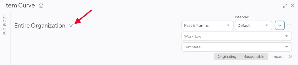
Click the filter icon, and the Item Filter window will open.
-
- Update the item filters to control which Items are included in the Report's metrics.
- Click Save.
- Click the Locations panel on the left side of the Report to expand it.
- Filter the Report by Location and only Items tied to the selected Locations will be included in the Report.
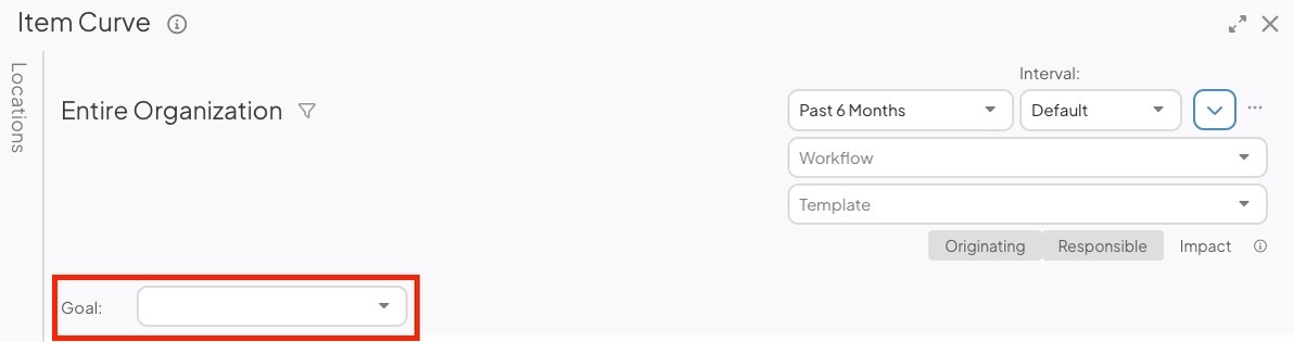
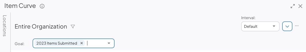
Show Goals on the Report
There will be a Goal drop-down if your organization has at least one Item Goal created. The drop-down will contain each of your organization's Items Submitted and Items Completed Goals. If your organization does not have any Item Goals, this drop-down will be absent.
Pro Tip: Check out this article learn more about how Goals work and different ways you can visualize them.
When you make a selection in the Goal drop-down, any existing filters applied to the Report are cleared and replaced with filters matching the criteria of your selected Goal. This ensures the Report displays all Items contributing to the Goal.
Example of what the Report controls look like after a Goal has been selected. The Quick Filters are hidden except for the interval drop-down.
Warning: You can continue to tweak Report Filters after the Goal has been selected, but it might result in the Goal no longer being shown on the Report.
Selecting a Goal adds a gold diagonal Goal line to the Report.

- You must select a Location in the Location Filter for the Goal line to appear on the Report. The Goal line will change position based on the Location's Goal.
It is possible for each Location to have two Goal Values for a single Item Goal: a Location Only Goal and a Location & Below Goal. Which Goal is displayed depends on the Location & Below checkbox on the Location Filter.
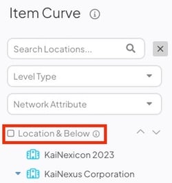
- If Location & Below is not selected, the Report will show Location Only Goals. Contributions from Locations nested beneath each Location will not be included in Report data.
- If Location & Below is selected, the Report will show the Location & Below Goals. Contributions from Locations nested beneath each Location will be included in Report data.
Share the Report
To share the Report, select the ellipsis icon. In the resulting drop-down menu, you can export the Report as a PDF or copy the Report to a Board.
- Select Print/Save PDF to export the Report. The "Print" window will open.
- Page Size: Expand the drop-down to choose your preferred page size.
- Scale: Expand the drop-down to choose the scale percentage. This allows you to fit more content on a single page. For example, selecting 50% doubles the amount of content you can fit on one page. Make sure to select "Fit to page" in your browser's print settings.
- Click either Portrait or Landscape to choose the PDF's orientation.
- Click Print.
The Location of the Report will appear on the exported PDF beneath the Report title.
- Select Copy to Board to add the Report as a Card on a Board.
- In the resulting window, select a Board. All Boards that you have permission to edit will appear as options.
- Select Copy to add the Report to your selected Board. All filters included on the Report will be carried over to the Card.
- The Report Card will appear at the Board's top left corner.