
Every Template has a set of Fields that determine what information users can capture on Items of that type.
From the Templates administration page, you can configure the Fields already added to a Template, including whether a Field is required, how it is displayed, and other available settings and advanced options.
Who can edit a Template's Fields?
Anyone with the Quality Admin permission can edit a Template's Field settings.
Adding new Fields to a Template, removing existing ones, or reordering them can only be done by KaiNexus staff. Contact your Customer Success Manager for help with any of these.
How to edit a Template's Fields
To edit a Template's Fields:
- Navigate to the Templates administration page.
- Hover over the Template you want to work with, and select the column icon.
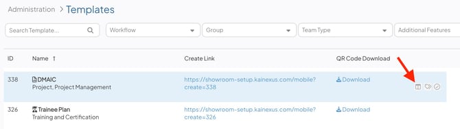
- The Fields grid will open, showing every Field currently on the Template.
/Ofie/Ofie%20Profile%20Pic.png?width=50&height=50&name=Ofie%20Profile%20Pic.png) Pro Tip: The Fields grid will list all of a Template's Fields, regardless of whether they are archived, added to the layout, or hidden by conditional logic.
Pro Tip: The Fields grid will list all of a Template's Fields, regardless of whether they are archived, added to the layout, or hidden by conditional logic.
In the Fields grid, you can update:
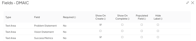
- Required: Choose if and when this Field should be required
- No: The Field will never be required.
- To Submit: The Field will be required on the Create screen and for the rest of the Item's lifecycle.
- To Assign: The Field will be required when transitioning the Item to an Active status and on any Items already in an Active status.
- To Complete: The Field will be required when transitioning the Item into a Complete or Resolution Submitted status.
- Show On: Use the checkboxes to determine which Status transition windows (Submit, Assign, Complete) this Field should appear on.
- Populated Field: When enabled, this Field is included in the Fields Populated calculation shown on Item Lists.
- Allow Images (Text Areas only): When enabled, users can add an image or Chart thumbnail into this Field.
- Hide Label: When enabled, hides this Field's name on Items' work panels.
Type and Field are shown for reference but can't be changed here.
When you're finished, select Save on the Fields grid. Remember to refresh your browser to see your changes take effect.
Configure advanced settings for a Field
To further configure a Field, select the gear icon next to it.
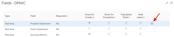
This opens the Field's advanced settings, where you can:
- Add a description
- Set placeholder text
- Specify the required format of data entered into a Text Field
- Set the Field's value inheritance configuration
- Set a Text Area's default height, minimum and maximum character limits, and/or allow it to grow
- Configure the width of Text Fields, Number Fields, and Date Fields
- Set a Number Field's minimum and maximum value
- Configure the Field's label
- Allow past dates in Date Fields and Date Time Fields
- Set and lock a Default Value
- Make the Field private and determine who can see it
- Configure an Ad Hoc Field
- Move the Field to the Additional section on the Complete/Resolution screens
When you're finished updating the Field, select Done on the Field's advanced settings window, and select Save on the Template's Fields grid.
Remember to refresh your browser to see your changes take effect.
Add a description

If a Field on a Template is configured with a description, that description will appear when users hover over the Field's label on Items.
Set Placeholder Text
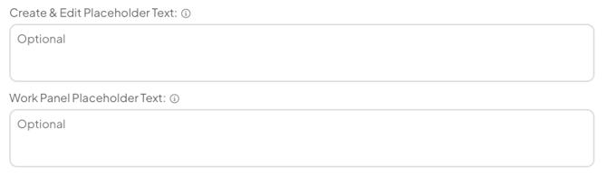
Placeholder text can be set for Text Fields, Text Areas, and File Fields (on the Item work panel).
-
Create & Edit Placeholder Text: Enter the text that should be displayed on the Create and Edit windows when this Field is empty.
- Work Panel Placeholder Text: Enter the text that should be displayed on the Item work panel when this Field is empty.
Specify the required format of data entered into a Text Field
By default, any text can be entered into a Text Field. However, Text Fields can be configured with a required format (regex). If a user tries to enter a value in the wrong format, the Field will be outlined in red and a warning — also configurable — that the entered value is invalid will appear.
- Regex: Enter the format in which data must be entered into this Text Field using regex.
- Example: If the data entered should always be a phone number but the exact format doesn't matter, the regex might be "^\(?\d{3}\)?[- ]?\d{3}[- ]?\d{4}$", meaning "3 single digits (possibly enclosed in parenthesis), possibly followed by a dash, followed by 3 single digits, possibly followed by a dash, followed by 4 single digits."
- Regex Invalid Text: By default, if a user enters a value that does not match the regex format, they'll see the warning "The value in this field is invalid." This is likely not enough information for frontend users, so it is helpful to enter a customized warning message into the Regex Invalid Text field that explains the correct format in human language (rather than regex code).
- Using the example above: The warning message for a permissive regex doesn't need to be too specific. "Enter a 10 digit phone number" would likely suffice in this case.
Set the Field's value inheritance configuration
A Field can be configured to inherit its value from the same Field on its Parent Item, its most recently updated Child Item, or both.
Enabling Field inheritance (also called Field syncing) will not affect the values in that Field on existing Items. However, the next time a user updates that Field, inheritance will be triggered as appropriate. For more information on Field syncing, check out this support article.
- Inherit Values: Expand the drop-down to select from which Item this Field should inherit its value. Choose between:
- Off: This Field will not inherit values on Items of this type.
- Inherit Child: If a Parent Item of this type has a Child Item that has this same Field configured, updating this Field's value on the Child Item will automatically update the Field's value on the Parent Item.
If there are multiple Children with the same Field, the Parent Item will inherit the value of the most recently updated Field.
-
- Inherit Parent: If a Child Item of this type has a Parent Item that has this same Field configured, updating this Field's value on the Parent Item will automatically update the Field's value on the Child Item.
- Bidirectional: If this same Field has been configured on both a Parent Item and one or more Child Items, updating this Field's value on the Parent Item will automatically update the Field's value on the Child Items and vice versa.
If there are multiple Children with the same Field, the Parent Item will inherit the value of the most recently updated Field of its Children.- Bidirectional logic does not apply when an Item is first created.
Caution: For Bidirectional inheritance to work, this Field's inheritance logic must be set to Bidirectional on both the Parent's Template and the Child's Template.
Set a Text Area's default height, minimum and maximum character limits, and/or allow it to grow
By default, Text Areas on an Edit modal have a standard height, have no character limits, and do not grow taller to fit the entered text.
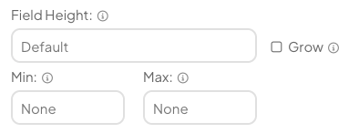
- Field Height: Enter a numerical value to specify how many pixels tall this Field should be. Text Areas must be at least 100 pixels tall. If a value of less than 100 is entered, it will be ignored and 100 will be used instead. This change will not affect the Field's height on Item work panels.
- Grow: When enabled, the Field will automatically grow larger as text is typed into it.
- Min and Max: Enter numerical values to specify the minimum and maximum number of characters that can be entered into this Field.
Caution: For performance reasons, do not enable the Grow checkbox on more than a few Text Areas per Template.
Configure the width of Text Fields, Number Fields, and Date Fields
By default, a Field on an Item's Create or Edit window will be as wide as can fit in that window. To make a Field narrower, configure its Width.
- Width: Enter a numerical value to specify how many pixels wide this Field should be.
Set a Number Field's minimum and maximum value
- Min: Enter a (non-negative) numerical value to specify the lowest number that can be entered into this Field.
- Max: Enter a (non-negative) numerical value to specify the highest number that can be entered into this Field.
Decimals can not be used in the Min and Max fields. If a decimal is entered, once the Template is saved that value will round down to the nearest whole number. E.g., if "1.99" is entered, it will become "1" after saving the Template.
Configure the Field's label
A Field's label can be configured to appear on Item work panels either above the Field or to its left. This configuration will have no effect if Hide Label is enabled for that Field and will never affect the label's position on the Create or Edit windows.
The Field's label is the label for the Field.
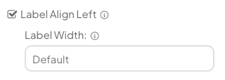
- Label Align Left: By default, Field labels appear above the Field. If you'd like the label to appear to the left of the Field on Item work panels, select this box.
- Label Width: Only available when the Field's label is aligned left. Enter a numerical value to specify how many pixels wide this Field's label should be.
Allow past dates in Date Fields and Date Time Fields
By default, Date and Date Time Fields allow users to enter past dates. These Fields can be configured, however, so that past dates are not permitted.
- The Allow Past Dates checkbox: When enabled, users can enter any date. When disabled, users can only enter a current or future date.
If Allow Past Dates was previously enabled on a Field and is later disabled, the values in that Field on existing Items will not be affected. However, the next time a user tries to save an Edit modal on which that Field is visible it will be marked as invalid if the date is in the past.
Set and lock a default value
Text Areas and Text Fields can be configured to be automatically populated with a default value. This default value will appear in those Fields on the Create screen and whenever the Field is saved with no value on existing Items.
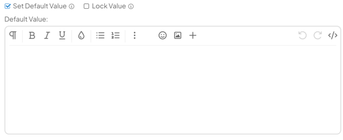
- The Set Default Value checkbox: Check this checkbox if this Field should have a default value; uncheck this checkbox to stop using a default value that has already been configured. When enabled, the Lock Value checkbox will appear to its right and the Default Value text area will appear below it.
- The Lock Value checkbox: When enabled, users will be unable to edit this Field's value on any Item. On Edit modals, locked Text Areas will have a hidden label (regardless of the Hide Label configuration) and the Default Value will appear on its own without a text box; locked Text Fields will be displayed with their label and text box but will be grayed out.
When not enabled, users will be able to edit this Field's value as normal. - Default Value: Enter this Field's default value.
Pro Tip: Changes to a Field's default value affect new Items immediately, but existing Items are only updated if the Field is still using the original default value and has not been manually saved. Once a value has been manually saved on an Item, it is treated as user-entered data and will not automatically change when the Template's default value is updated or removed.
Make the Field private and determine who can see it
Text Fields, Text Areas, Number Fields, Date Fields, and Date Time Fields can be configured as Private Fields. Their values are hidden by default and can only be viewed by users specified in the Field's configuration or by users with the Private Fields Manager permission.
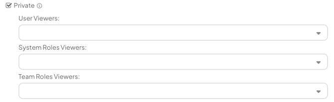
- Private: When enabled, the Field's value is hidden by default and can only be viewed by users who meet the configured viewer criteria or have the Private Fields Manager permission.
Enabling Private automatically disables and locks the Show on Create, Show on Assign, Show on Complete, and Required settings. These settings cannot be enabled while the Field is private. - User Viewers: Add specific users who can view the Field's value.
- System Role Viewers: Add specific System Roles who can view the Field's value.
- Team Role Viewers: Add specific Team Roles that can view the Field. Users assigned one of these Team Roles on the Item can view the Field's value. Any Team Role, including Custom Team Roles, can be selected except Follower.
Configure an Ad Hoc Field
Note: For AdHoc Fields, Number of Columns and each column's Type are shown for reference but can't be changed here.
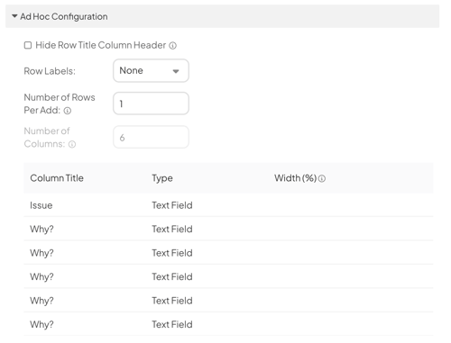
- Hide Row Title Column Header: When unchecked, the column containing each row's label will be labeled "Row Title." When enabled, that column will not be labeled.
If Row Labels is set to "None," this setting will have no effect. - Row Labels: Expand the drop-down to select which label should be used for this AdHoc column's rows.
- The rows will not be labeled and the "Row Title" column will not be present in this Field.
- Numeric: The rows will be labeled numerically, with the top row labeled as "1," the next row down as "2," etc.
- Fixed Text Plus Row Number: When selected, the Fixed Text field will appear below the drop-down. The rows will be labeled with the value entered into the Fixed Text field followed by the row number.
- The Fixed Text field: Enter the text that should be used in the row labels.
- Fixed Text: When selected, the Fixed Text field will appear below the drop-down. The rows will be labeled with the value entered into the Fixed Text field. Users can not edit this label on their AdHoc Fields.
- The Fixed Text field: Enter the text that should be used in the row labels.
- Open Text: When selected, each row will have a text field in place of a label. Users will be able to enter any label they want for each row.
- Number of Rows Per Add: Enter the number (1-6) of rows that should be added to this AdHoc Field each time a user clicks "Add Row."
- Number of Columns: Indicates the number of columns in the Ad Hoc Field. Only editable by internal KaiNexus staff.
- The column grid:
- Column Title: Enter the title that should appear in this column's header.
- Type: Indicates whether the column contains a Text Field, Number Field, Date Field, or an Attribute. Only editable by internal KaiNexus staff.
- Width(%): By default, all of an AdHoc field's columns will be of equal width on an Item's work panel. To change the width of a particular column, enter the desired width as a percentage of the whole.
You do not need to enter a width for all columns; any columns without an assigned width will be of equal width based on the remaining available space. For example, if column A is assigned a width of 50% and columns B and C are not assigned a width, columns B and C will each have an implicit width of 25%.
- To further configure each AdHoc column, hover over the row and click the pencil icon that appears to its right and the AdHoc Column Advanced window will open.
- Description: For all types of columns, enter an optional description in this field. This description will appear as a tooltip when users hover over the column header.
- For Date Fields, decide whether past dates should be permitted as described above.
- For Number Fields:
- Configure the format as described above.
- Define the minimum and maximum values.
- Decide whether decimals should be permitted.
- Check the Show Total checkbox if the total value should be shown at the bottom of this column on Item work panels.
- Check the Show Average checkbox if the average value should be shown at the bottom of this column on Item work panels.
- When you're finished configuring the column, click Done on the AdHoc Column Advanced window.
Move the Field to the Additional section on the Complete/Resolution screens
By default, a Field configured as Show on Complete will appear above the Additional section on the Complete/Resolution screens. Such a Field can be configured so that, if it is already populated, it will be placed inside the collapsed Additional section instead.
- Move to Additional: When enabled, if already populated, a Field configured as Show on Complete will be moved into the collapsed Additional section. An unpopulated Field will still appear above the Additional section.
When disabled, a Field configured as Show on Complete will appear above the Additional section whether it's populated or not.
Limitations
The following can only be changed by KaiNexus staff. Contact your Customer Success Manager if you need any of these updated:
- Adding, removing, or reordering Fields on a Template
- Changing a Field's Type, or which Field is assigned to a given row
- Configuring Conditional Logic Groups (rules that control when a Field appears based on an Attribute or Location)
- An AdHoc Field's Number of Columns or each column's Type