
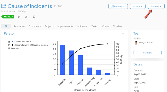
Analyze which problems need your attention first with a Pareto Chart.
![]() REQUIRED: The Chart Module is required to perform the functions on this support page. Reach out to your Customer Success Manager to enable Charts for your organization.
REQUIRED: The Chart Module is required to perform the functions on this support page. Reach out to your Customer Success Manager to enable Charts for your organization.
A Pareto Chart is a vertical bar graph in which values are displayed in decreasing order of relative frequency from left to right. The taller the bar on the Chart, the greater the cumulative effect that variable has on a given system.
- The height of the bar represents the frequency or cost of the problem.
- The bars are presented in descending order (from tallest to shortest).
- A line representing the cumulative percentage of each category is automatically added and recalculated each time the data is updated.
By comparing the data in the bars with the cumulative percentage line, you can determine which defects to prioritize in order to observe the greatest overall improvement.

Example of a Pareto Chart.
Who can edit a Pareto Chart?
Only the following people can edit a Chart's Details or its data:
- Anyone on the Chart's Team except for Followers or Participants.
- Anyone with the “Edit” permission for Items in the Chart's Location(s).
![]() For more information on Team Roles (like Authors, Facilitators, Participants, and more!) check out this article.
For more information on Team Roles (like Authors, Facilitators, Participants, and more!) check out this article.
Edit a Pareto Chart’s Details
A Chart's Details consist of its non-data elements including:
- Fields and Attributes
- Its parent — the Item under which the Chart is nested
- Other settings such as whether or not the Chart should be private or be granted Honor Roll may be available depending on how your organization has configured its Charts and your own permissions within the system.
To edit a Chart's Details, open the Chart with which you want to work, then:
- Click Actions in the top right corner of the page.
- Click Edit Details in the resulting drop-down menu.
- Update any of the aforementioned elements.
- Click Save.
Enter Data for a Pareto Chart
You will use the data entry window to enter data for your Chart. A Chart's data includes not only the individual data points but also how those data points are displayed.
To start entering data, open the Chart with which you want to work, then:
- Either click Actions in the top right corner of the page or click the ellipsis in the top right corner of the panel containing the Chart.
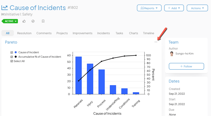
- Click Edit Chart in the resulting drop-down menu.
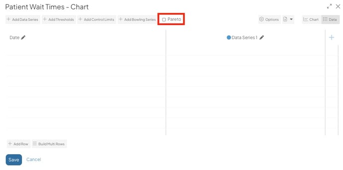
- The Chart's Edit Data window will open. By default, Charts are Bar/Line Charts. After you select the Pareto checkbox, it becomes a Pareto Chart.
In the data entry window, you can:
- Decide whether the Chart will use dates or categories
- Add a data series
- Edit an existing data series
- Delete an existing data series
- Add data rows
- Delete data rows
- Add and update data points
- Export data
- Import data
Switch between Date or Category
![]() NOTE: A Pareto Chart's horizontal axis can only be category-based. As such, you will not be able to switch to a date-based format.
NOTE: A Pareto Chart's horizontal axis can only be category-based. As such, you will not be able to switch to a date-based format.
Add a Data Series
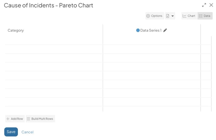
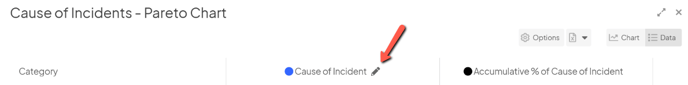
A Pareto Chart is comprised of exactly two data series — the data series which you must create and to which you must enter data, and the "Accumulative %."
The data series:
- Must be displayed as a series of bars.
- Must use the left Y-Axis
- Must be manually created and its data manually added.
The "Accumulative %" series:
- Must be displayed as a line.
- Must use the right Y-Axis.
- Will be automatically created when the Chart is first saved after the data series is added.
- Will be automatically updated each time the Chart is saved.
When you add data to an empty Pareto Chart, there will be a blank data series column you can use to start entering data immediately. Due to the structure of a Pareto Chart, there is no need to add additional data series.
- Click into each cell and enter a value to populate data.
Select the pencil icon to edit the data series. You can make changes such as changing the name of the data series and updating its color.
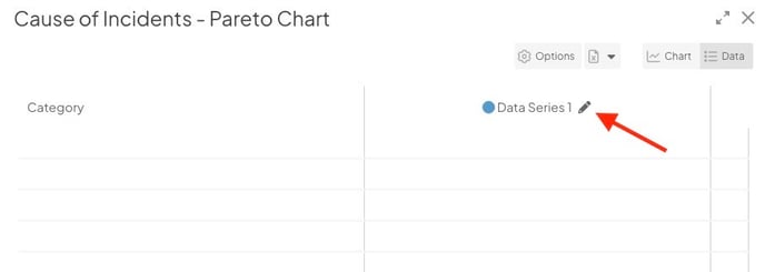
- The Edit Data Series window will open:
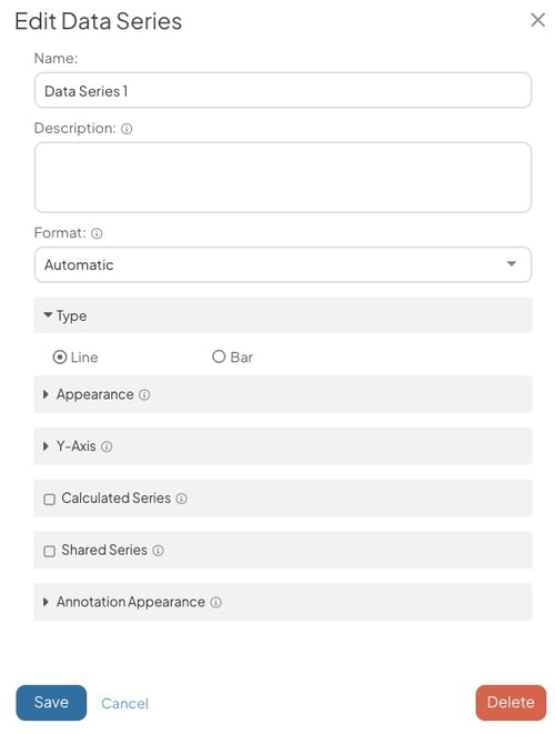
- Name (required): The name will be used to identify this series.
- Description: Enter an optional description in this field. The description will appear when hovering over the name of the series on both the Edit Data window and on the Chart's legend.
- Format (required): Expand the drop-down to choose in which format you want data in this to be displayed. Once you've made a choice, the predefined format will appear in the field. Edit that predefined format to configure the appearance of this series's data further.
- Click the Appearance header to open that section.
-
-
- Bar/Line Color: Click inside the color code field to open the color picker, choose in which color this series will be displayed, then click Save on the color picker.
- The Show Values checkbox: When this box is checked, the value of each data point on this series will appear by its bar on the Chart.
- Click the Annotation Appearance header to open that section.
- Click inside the color code field to open the color picker, choose in which color Annotations on this series will be displayed, then click Save on the color picker.
- Click Save to save your changes and return to the Edit Data window. You will not be able to create any additional series.
- Click Save on the Edit Data window to save the Chart. The "Accumulative %" series will be automatically created.
-
Edit an existing series
To edit an existing series, open the Chart's Edit Data window as described above, then:
- To edit the data series, click the pencil icon next to the series's name; to edit the "Accumulative %" series, click its name. The "Edit Series" window will open.
- Make any changes necessary as previously described.
- Click Save to update the data series and return to the Edit Data window.
- Click Save to update the Chart.
/Ofie/Ofie%20Profile%20Pic.png?width=50&height=50&name=Ofie%20Profile%20Pic.png) Pro Tip: If you only need to edit the name of a data series, you can in-line edit the title. Just select the title, enter your update, and select Save.
Pro Tip: If you only need to edit the name of a data series, you can in-line edit the title. Just select the title, enter your update, and select Save.
Delete an existing series
To delete an existing series, open the Chart's Edit Data window as described above, then:
- To delete the data series, click the pencil icon next to the series's name and the "Edit Series" window will open. The "Accumulative %" series cannot be manually deleted.
- Click Delete. The "Edit Series" window will close and the series will no longer appear on the Edit Data window. After saving, the "Accumulative %" series will be deleted as well.
- Click Save to update the Chart.
Add rows
Once at least one series has been added to the Chart, you will be able to add rows. To do so, open the Chart's Edit Data window as described above, then:
- To add a single row, click Add Row.
- To add multiple rows at once, click Build Multi Rows. A new window will open so that you can specify how many rows will be added.
-
- Row Count: Enter the number of rows that should be added.
- Click Save.
-
- Once rows have been added, click the category field for each one to change its name.
- Click Save to update the Chart.
Pro Tip: When you are editing the bottom row of chart data, you can add a new row by selecting "enter" on your keyboard.
Delete rows
To delete an existing row, open the Chart's Edit Data window as described above, then:
- Hover over the row you want to delete so that it's highlighted blue.
- Click the x button that appears to its right. The row will disappear from the Edit Data window.
- Click Save to update the Chart.
Add and edit data
Warning: Only the data series can be edited. The "Accumulative %" series will be automatically updated each time that Chart is saved.
Once rows have been added, individual data points can be entered. To do so, open the Chart's Edit Data window as described above, then:
- Click inside the appropriate column and row intersection. The selected cell will have a blue outline.
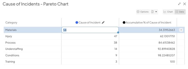
- Enter the desired value.
- Repeat this step for every data point that must be added.
- Select "enter" on your keyboard to continue entering data in the same column.
- You can navigate between cells using the arrow keys or "tab" key on your keyboard.
- Click Save to update the Chart.
Pro Tip: When you select a cell, there will be a blue dot in the bottom right corner. Double-click the blue dot to copy the cell's value to all remaining cells in the column.
Export the Chart's data
To export a Chart's data, open the Chart's Edit Data window as described above, then:
- Click the Excel File icon.
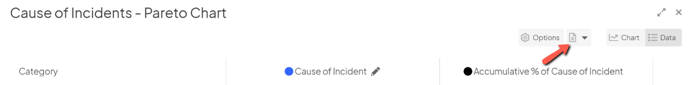
- Click Download in the resulting drop-down.
Import data into a Chart
To import data into a Chart, open the Chart's Edit Data window as described above, then:
- Click the Excel File icon.
- Click Upload in the resulting drop-down.
- The "Chart Data Import" window will open:
- Either drag the file you want to import onto the resulting window or click the window and choose the correct file from your computer.
- A confirmation screen will appear with details about your import. Click Ok, got it.
![]() For more information on importing data into a Chart, check out this article.
For more information on importing data into a Chart, check out this article.
For information on importing data for multiple Charts at once, check out this article.
Everything else!
![]() For information on working with a Chart's advanced configuration options, refer to this article.
For information on working with a Chart's advanced configuration options, refer to this article.