
Use Control Charts to monitor performance and generate an alert if the data is outside of the control limits.
Control Charts are used to study how a process changes over time. They include a center line (the process mean or average), an upper control limit, and a lower control limit. The control limits, determined from historical data, represent the process variation and show what the typical or expected range of variation is.
By comparing current data to these historical data lines, you can draw conclusions about whether the process variation is consistent (in control) or unpredictable (out of control, affected by special causes of variation).
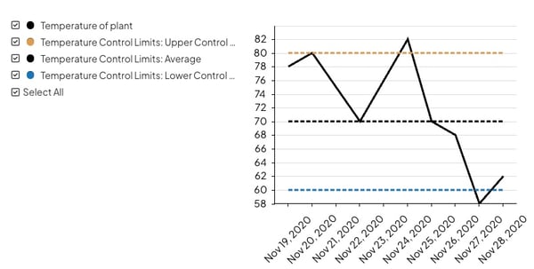
Example of a Control Chart.
What happens when the data is outside of control limits?
- Notifications may be sent to the Chart's Team (depending on how the Control Limit series is configured).
- A red exclamation point will be displayed next to the Chart’s name on any list of Charts.
Who can edit a Control Chart?
Only the following people can edit a Chart's Details or its data:
- Anyone on the Chart's Team except for Followers or Participants.
- Anyone with the “Edit” permission for Items in the Chart's Location(s).
![]() For more information on Team Roles (like Authors, Facilitators, Participants, and more!) check out this article.
For more information on Team Roles (like Authors, Facilitators, Participants, and more!) check out this article.
Edit a Control Chart’s Details
A Chart's Details consist of its non-data elements including:
- Fields and Attributes
- Its parent — the Item under which the Chart is nested
- Other settings such as whether or not the Chart should be private or be granted Honor Roll may be available depending on how your organization has configured its Charts and your own permissions within the system.
To edit a Chart's Details, open the Chart with which you want to work, then:
- Click Actions in the top right corner of the page.
- Click Edit Details in the resulting drop-down menu.
- Update any of the aforementioned elements.
- Click Save.
Enter data for a Control Chart
You will use the data entry window to enter data for your Chart. A Chart's data includes not only the individual data points but also how those data points are displayed.
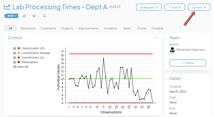
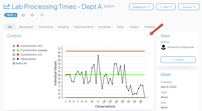
To edit a Control Chart's data, open the Chart with which you want to work, then:
- Either click Actions in the top right corner of the page or click the ellipsis in the top right corner of the panel containing the Chart.
- Click Edit Chart in the resulting drop-down menu.
- The Chart's data entry window will open. By default, Charts are Bar/Line Charts. After at least one Control Limit is added, it becomes a Control Chart.
In the data entry window, you can:
- Decide whether the Chart will use dates or categories
- Add a Control Limit series
- Add a data series
- Edit an existing data series
- Delete an existing data series
- Add data rows
- Delete data rows
- Add and update data points
- Export data
- Import data
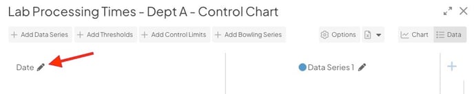
Switch between Date or Category
A Control Chart's horizontal axis can be either date-based or category-based. By default, a new Control Chart will use dates.
To change which is used, open the Chart's Edit Data window as described above, then:
- Click the pencil icon next to "Date" or "Category."
- In the resulting window, click either the Date or Category radio button to make your selection.
- If you select "Category," click Save.
If you select "Date," additional configuration options will appear.
- The Use exact dates entered checkbox: When this box is checked, the Chart will display the exact dates entered. When this box is unchecked, the Chart will automatically calculate the best dates to display to create an even interval between the dates entered.
- The Show time on Chart checkbox: When this box is checked, the date and time for each data point will be displayed on the Chart. When this box is unchecked, only the date will be shown for each data point.
- Click Save.
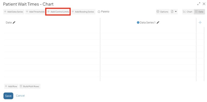
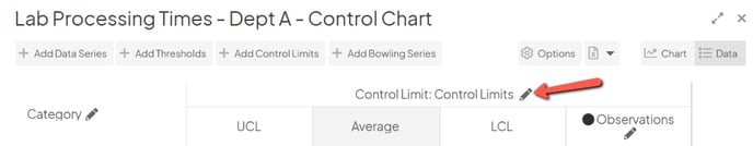
Add a New Control Limit Series
A Control Limit series consists of an upper control limit, an average, and a lower control limit.
To create a new Control Limit series, open the Chart's Edit Data window as described above, then click Add Control Limits. The "Add Control Limits" window will open:
- Name (required): The name will be used to identify this series.
- Description: Enter an optional description in this field. The description will appear when hovering over the name of the series on both the Edit Data window and on the Chart's legend.
- Format (required): Expand the drop-down to choose in which format you want data in this to be displayed. Once you've made a choice, the predefined format will appear in the field. Edit that predefined format to configure the appearance of this series's data further.
- Under the "Upper Control Limit" header:
- Title: The title will be used to identify this control limit.
- Color of data points when above control limit: Click inside the color code field to open the color picker, choose in which color a data point that lies above this control limit will be displayed, then click Save on the color picker.
-
- Click the Appearance subheader to open that section:
- Line Color: Click inside the color code field to open the color picker, choose in which color this control limit will be displayed, then click Save on the color picker.
- The Show Markers checkbox: When this box is checked, a round marker will appear at each data point on the control limit's line on the Chart.
- The Show Values checkbox: When this box is checked, the value of each data point on this control limit will appear by its line on the Chart.
- Click the Appearance subheader to open that section:
![]() Pro Tip: "Show Markers" or "Show Values" can be enabled. They cannot both be enabled for the same series.
Pro Tip: "Show Markers" or "Show Values" can be enabled. They cannot both be enabled for the same series.
-
-
- The Send to Back checkbox: When this box is checked, this series's line will be arranged behind any other series on the Chart.
- The Dashed Line checkbox: When this box is checked, this series will be displayed as a dashed line rather than a solid line.
-
- Under the "Average" header:
- Title: The title will be used to identify this line.
- Click the Appearance subheader to open that section, then customize the appearance of this line as described above.
- Under the "Lower Control Limit" header:
- Title: The title will be used to identify this control limit.
- Color of data points when below control limit: Click inside the color code field to open the color picker, choose in which color a data point that lies below this control limit will be displayed, then click Save on the color picker.
- Click the Appearance subheader to open that section, then customize the appearance of this line as described above.
- Under the "Rules" header:
- The Rule 1 checkbox: When this box is checked, the Chart will be flagged if the most recent data point falls outside of the upper or lower control limits.
- The Rule 2 checkbox: When this box is checked, the Chart will be flagged if a certain number of consecutive data points fall on the same side of the average.
- # of data points: The value entered here will determine the number of consecutive data points that must fall on the same side of the average before the Chart will be flagged as per Rule 2.
- The Rule 3 checkbox: When this box is checked, the Chart will be flagged if three out of the four most recent data points are closer to the same control limit than they are to the average.
- Click the Annotation Appearance header to open that section.
- Click inside the color code field to open the color picker, choose in which color Annotations on this series will be displayed, then click Save on the color picker.
- Click Save to create the Control Limit series and return to the Edit Data window or click Save & Add Data Series to create the Control Limit series and immediately open the "Add Data Series" window.
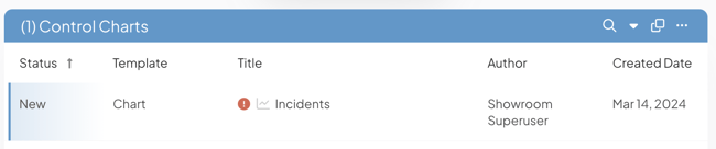
/Ofie/Ofie%20Profile%20Pic.png?width=50&height=50&name=Ofie%20Profile%20Pic.png) Pro Tip: When the latest data point in your Control Chart is outside the Control Limit, the Chart will have an exclamation point icon beside its title on the Item Work Panel and in Item Lists, giving you greater visibility.
Pro Tip: When the latest data point in your Control Chart is outside the Control Limit, the Chart will have an exclamation point icon beside its title on the Item Work Panel and in Item Lists, giving you greater visibility.
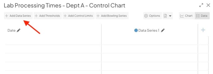
Add a Data Series
A data series consists of the data which will be compared to the control limits.
When you add data to a Chart for the first time, there will be a blank data series column you can use to enter data immediately.
- Click into each cell and enter a value.
- Select the pencil icon to edit the data series. You can make changes such as updating the data series' color and whether it appears as a bar or a line.
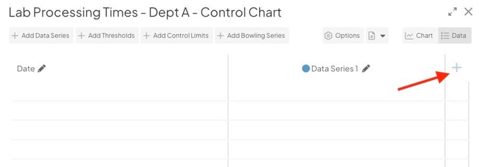
There are two ways to add a new data series to your Chart.
- You can select the + button to the right of your existing data series. A new column will appear, and you can start entering data immediately.
- Or, you can select Add Data Series. The “Add Data Series” window will open, and you can enter the new data series settings before entering the data itself.
In the Add Data Series window or Edit Data Series window (if you are updating an existing Data Series), you can update the following settings:
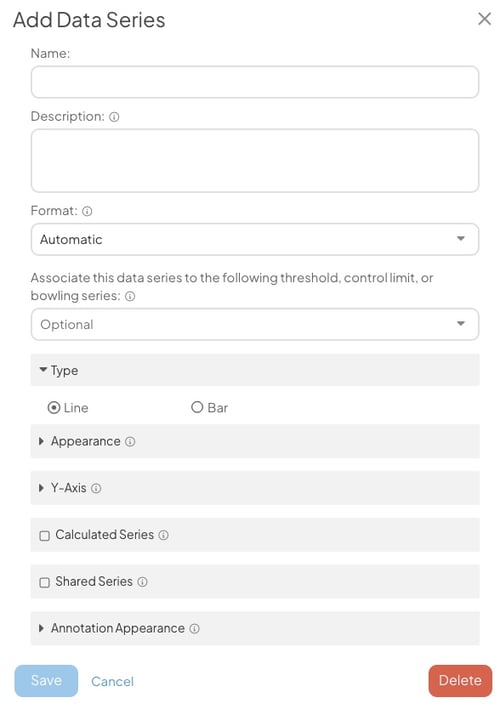
- Name (required): The name will be used to identify this series.
- Description: Enter an optional description in this field. The description will appear when hovering over the name of the series on both the Edit Data window and on the Chart's legend.
- Format (required): Expand the drop-down to choose in which format you want data in this to be displayed. Once you've made a choice, the predefined format will appear in the field. Edit that predefined format to configure the appearance of this series's data further.
- Associate this data series to the following threshold, control limit, or bowling series: Expand the drop-down to choose with which of the Chart's Control Limit series this data series will be associated.
Pro Tip: You can also use click and drag on the Chart Edit window to associate a data series with a Threshold, Control Limit, or Bowling Series.
- Under the Type header:
- Click either the Line or Bar radio button to decide whether this series should be displayed as a line or as a bar.
- Click the Appearance header to open that section. The options shown here will be largely determined by your choice of line or bar above.
- If this is a line data series:
- Bar/Line Color: Click inside the color code field to open the color picker, choose in which color this series will be displayed, then click Save on the color picker.
- Line Width: The value (1–10) entered here will determine the width of this series's line on the Chart.
- The Show Markers checkbox: When this box is checked, a round marker will appear at each data point on the series's line on the Chart.
- The Show Values checkbox: When this box is checked, the value of each data point on this series will appear by its line on the Chart.
- If this is a line data series:
![]() Pro Tip: "Show Markers" or "Show Values" can be enabled. They cannot both be enabled for the same series.
Pro Tip: "Show Markers" or "Show Values" can be enabled. They cannot both be enabled for the same series.
-
-
- The Send to Back checkbox: When this box is checked, this series's line will be arranged behind any other series on the Chart.
-
-
-
- The Dashed Line checkbox: When this box is checked, this series will be displayed as a dashed line rather than a solid line.
- The Fill checkbox: When this box is checked, the space beneath the series's line will be filled in on the Chart. If enabled, the following options will appear beneath the checkbox:
- Fill Color: Click inside the color code field to open the color picker, choose in which the fill for this series will be displayed, then click Save on the color picker.
- Fill Opacity: Expand the drop-down to choose with what opacity you want the fill to be displayed.
- If this is a bar series:
- Bar/Line Color: Click inside the color code field to open the color picker, choose in which color this series will be displayed, then click Save on the color picker.
- The Show Values checkbox: When this box is checked, the value of each data point on this series will appear by its bar on the Chart.
-
- Click the Y-Axis header to open that section.
- Click either the Left or Right radio button to decide whether Y-axis for this series should be displayed on the left or right side of the Chart.
- The Calculated Series checkbox: Check this box to turn this series into a Calculated series. Such a series will calculate the sum, difference, average, percent, percent change, product, or quotient of other data series currently on this Chart. If checked, the "Shared Series" header will disappear and a new field will appear:
- Operator: Expand the drop-down to choose which operator the Calculated series will use. Depending on the operator chosen, additional required fields will appear.
- If Sum, Average, or Multiply are selected:
- Series: Expand the drop-down to select every data series that should be used in this calculation.
- If Difference is selected:
- Series to subtract from: Expand the drop-down to select the data series from which the other data should be subtracted.
- Series to subtract: Expand the drop-down to select every data series that should be subtracted.
- If Percent or Divide are selected:
- Numerator Series: Expand the drop-down to select the data series that should act as the numerator.
- Denominator Series: Expand the drop-down to select the data series that should act as the denominator.
- If Percent Change is selected:
- Baseline or Original (% change from): Expand the drop-down to select the data series that should act as the baseline value.
- Actual or Current: Expand the drop-down to select the data series that should act as the current value.
- If Sum, Average, or Multiply are selected:
- Operator: Expand the drop-down to choose which operator the Calculated series will use. Depending on the operator chosen, additional required fields will appear.
- The Shared Series checkbox: Check this box to turn this series into a Shared series — a series that is mirrored from another Chart. The data on such a series will not be editable on this Chart but will reflect updates made to the data series on the original Chart. If checked, the additional fields will appear:
- Chart: Use this field to search for the Chart which contains the series you want to have shared. Once you've selected a Chart, the next field will be enabled.
- Series: Expand the drop-down to select which data series from the specified Chart you would like to add.
![]() Warning: Only data series can be shared across Charts. You cannot share a Threshold, Control Limit, or Bowling Series.
Warning: Only data series can be shared across Charts. You cannot share a Threshold, Control Limit, or Bowling Series.
- Click the Annotation Appearance header to open that section.
- Click inside the color code field to open the color picker, choose in which color Annotations on this series will be displayed, then click Save on the color picker.
- Click Save to create the data series and return to the Edit Data window.
- Repeat this process for any additional data series you need to add.
Edit an existing series
To edit an existing series, open the Chart's Edit Data window as described above, then:
- Click the pencil icon next to the series's name. The "Edit Series" window will open.
- Make any changes necessary as previously described.
- Click Save to update the data series and return to the Edit Data window.
- Click Save to update the Chart.
Pro Tip: If you only need to edit the name of a data series, you can in-line edit the title. Just select the title, enter your update, and select Save.
Delete an existing series
To delete an existing series, open the Chart's Edit Data window as described above, then:
- Click the pencil icon next to the series's name. The "Edit Series" window will open.
- Click Delete. The "Edit Series" window will close and the series will no longer appear on the Edit Data window.
- Click Save to update the Chart.
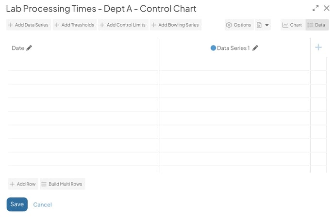
Add rows
Once at least one series has been added to the Chart, you will be able to add rows. To do so, open the Chart's Edit Data window as described above, then:
- To add a single row, click Add Row.
- To add multiple rows at once, click Build Multi Rows. A new window will open so that you can specify how many rows will be added. The options on this window will differ based on whether the Chart is using dates or categories.
- If using dates:
- Start Date: Enter the date of the first row to be added.
- End Date: Enter the date of the last row to be added.
- Step Unit: Expand the drop-down to choose whether a row should be added for each day, each week, or each month between those two dates.
- Click Save.
- If using categories:
- Row Count: Enter the number of rows that should be added.
- Click Save.
- If using dates:
![]() Pro Tip: Control limits are often the same for every row in a Chart. Save time by adding any control limits to the first row before clicking Build Multi Rows. The values will be copied into each new row and you won't need to enter them by hand!
Pro Tip: Control limits are often the same for every row in a Chart. Save time by adding any control limits to the first row before clicking Build Multi Rows. The values will be copied into each new row and you won't need to enter them by hand!
- Once rows have been added, click the date or category field for each one to change its date or name.
- Click Save to update the Chart.
Pro Tip: When you are editing the bottom row of chart data, you can add a new row by selecting "enter" on your keyboard.
Delete rows
To delete an existing row, open the Chart's Edit Data window as described above, then:
- Hover over the row you want to delete so that it's highlighted blue.
- Click the x button that appears to its right. The row will disappear from the Edit Data window.
- Click Save to update the Chart.
Add and edit data
Once rows have been added, individual data points can be entered. To do so, open the Chart's Edit Data window as described above, then:
- Click inside the appropriate column and row intersection. The selected cell will have a blue outline.
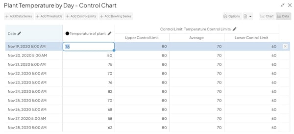
- Enter the desired value.
- Repeat this step for every data point that must be added.
- Select "enter" on your keyboard to continue entering data in the same column.
- You can navigate between cells using the arrow keys or "tab" key on your keyboard.
- Click Save to update the Chart.
Pro Tip: When you select a cell, there will be a blue dot in the bottom right corner. Double-click the blue dot to copy the cell's value to all remaining cells in the column. This is helpful when you need to enter the same control value for all data points in a series.
Export the Chart's data
To export a Chart's data, open the Chart's Edit Data window as described above, then:
- Click the Excel File icon.
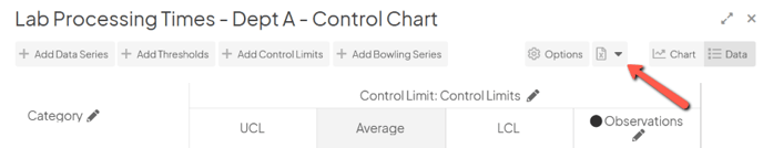
- Click Download in the resulting drop-down.
- If your Chart is using dates, you will need to select a Time Zone and then click Download in the resulting window.
Import data into a Chart
To import data into a Chart, open the Chart's Edit Data window as described above, then:
- Click the Excel File icon.
- Click Upload in the resulting drop-down.
- The "Chart Data Import" window will open:
- If your Chart is using dates, you will need to select a Time Zone.
- Either drag the file you want to import onto the resulting window or click the window and choose the correct file from your computer.
- A confirmation screen will appear with details about your import. Click Ok, got it.
![]() For more information on importing data into a Chart, check out this article.
For more information on importing data into a Chart, check out this article.
For information on importing data for multiple Charts at once, check out this article.
Everything else!
![]() For information on working with a Chart's advanced configuration options, refer to this article.
For information on working with a Chart's advanced configuration options, refer to this article.